Bitter Jeweler
Been spending a lot of time on here!
- Joined
- Apr 27, 2009
- Messages
- 12,983
- Reaction score
- 4,993
- Location
- Cleveland, Ohio
- Can others edit my Photos
- Photos OK to edit
I really like that!
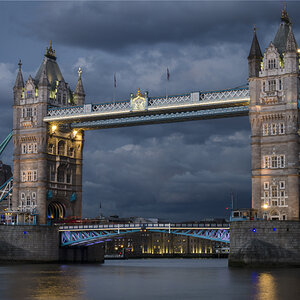
I seem to pay more attention to the detail in the bridge, meander back into the image, and then back up into the bridge details.
But you know, this is just my opinion.
I seem to pay more attention to the detail in the bridge, meander back into the image, and then back up into the bridge details.
But you know, this is just my opinion.
![[No title]](/data/xfmg/thumbnail/40/40285-2ce5915035c220ccb3485030863b62d0.jpg?1619739408)


![[No title]](/data/xfmg/thumbnail/40/40286-86401b94de8b01bea8bb4ea154aaea0a.jpg?1619739408)