
J.E.
TPF Noob!
- Joined
- Dec 15, 2006
- Messages
- 59
- Reaction score
- 0
- Location
- Loony Bin, Germany
- Can others edit my Photos
- Photos OK to edit
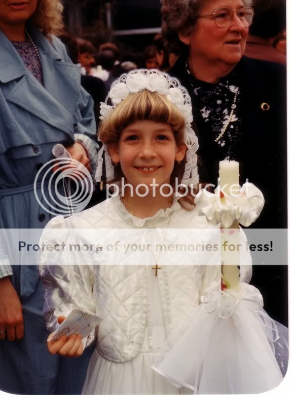
Okay, so this is me, ages ago. First Communion. Excuse the horrible 80's hair. Nobody asked me, I had no say with it. So useless to critique how horrible the fringe/pony looks. ")
Okay, obviously I'm not after critique on the shot itself, either, as I can't claim to have taken it. I had to work with what I had, which was this... a rather ordinary snapshot.
For my grandmas photo-calendar I scanned the above pic and PS'd it. I think I improved it...
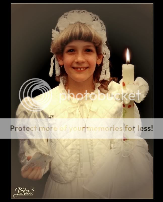
Anyway, I'm not sure about it. It's good enough for grams' photo calendar, that's for sure, but some things don't 'feel' right, only I don't know which exactly.
So what do you think about the following aspects:
1. The catchlights in the eyes? There obviously were none and I added them to give my eyes a more lively look. Only I'm not quite sure how well 'artificial' catchlights work. Are they okay? Too obviously PS'd?
2. The vignetting? It kind of dulls the corners down, I find? I wanted the shot to become a little softer and to give it some 'glow', but I don't know if I'm happy with it. What else could I have done?
3. The flame of the candle? Sometimes I think it's obvious it wasn't part of the picture originally (especially as I added it after vignetting the borders, duh!), sometimes I think it blends in well. Seems to depend on what time of the day it is. I don't know. What do you think?
4. Anything else that feels weird/not right/overdone?
Thank you for looking. I'm really hoping for some enlightenment here, so just be as honest as you can. :blushing:
Okay, obviously I'm not after critique on the shot itself, either, as I can't claim to have taken it. I had to work with what I had, which was this... a rather ordinary snapshot.
For my grandmas photo-calendar I scanned the above pic and PS'd it. I think I improved it...
Anyway, I'm not sure about it. It's good enough for grams' photo calendar, that's for sure, but some things don't 'feel' right, only I don't know which exactly.
So what do you think about the following aspects:
1. The catchlights in the eyes? There obviously were none and I added them to give my eyes a more lively look. Only I'm not quite sure how well 'artificial' catchlights work. Are they okay? Too obviously PS'd?
2. The vignetting? It kind of dulls the corners down, I find? I wanted the shot to become a little softer and to give it some 'glow', but I don't know if I'm happy with it. What else could I have done?
3. The flame of the candle? Sometimes I think it's obvious it wasn't part of the picture originally (especially as I added it after vignetting the borders, duh!), sometimes I think it blends in well. Seems to depend on what time of the day it is. I don't know. What do you think?
4. Anything else that feels weird/not right/overdone?
Thank you for looking. I'm really hoping for some enlightenment here, so just be as honest as you can. :blushing:

![[No title]](/data/xfmg/thumbnail/39/39288-2d76486ccc9042c6fb525aaaaffff1fb.jpg?1619738957)

![[No title]](/data/xfmg/thumbnail/40/40412-73276feced223de99c761fc2cc279db5.jpg?1619739461)
![[No title]](/data/xfmg/thumbnail/39/39292-4169a355b794ae9735845c4ad45d06ff.jpg?1619738958)