I really like the one in the middle. That's very interesting to me because there's so much going on in it. I have always loved variety! =)
The coloring is a bit funny though, but that could be just because I don't really like vintage/sepia.
TBH, Im afraid to get in the faces of my client, lol.. my 35mm lens is a new thing for me ( Thanks for your feedback. I have a whole plethora of B/w's ) This is my favorite one from the group. I kind of enjoy the lack of exposure.. I like the look (
I understand why you avoid getting very close to a face with a 35mm lens, but why are you afraid to get in your clients' faces in general?
#5: I like this composition the best of the set, but the model's facial expression is way over-the-top and I can't see her feet. The sky and some other areas are blown out, too, and the model's face needs more light.
These pictures feel very random, as if the photographer had no idea where to point the camera and no concept of balance.
#1 I dont know why I am supposed to see so much out of focus grass. The subject is almost bumped out of the top of the picture for all this meaningless green. Same problem with #4.
#2 This one has potential. But its not there yet. One gets dizzy because the camera wasnt kept straight. And the motive is nice, but the perspective looks random, not composed. There is just no balance yet.
#3 The subject faces to the left and is in the left part of the picture. Basically its falling out of the frame.
#4 See #1
#5 Again a lot of foreground for no good reason, as in #1 and #4. As if you would barely dare to look at the woman and even keep the camera down.
TBH, Im afraid to get in the faces of my client, lol.. my 35mm lens is a new thing for me ( Thanks for your feedback. I have a whole plethora of B/w's ) This is my favorite one from the group. I kind of enjoy the lack of exposure.. I like the look (
Thus having listed a few things that I think could be improved upon, do you plan to do a re-shoot? I think you should, by all means, and I'm sure you can do better.
#1 - i like this
#2 - Dont like her being so close to the rail. With the processing it is blending into her head.
#3 - overall I like this but the framing would have been better if you shot from where the swinging bench was instead of this side. Then she would have been in the same side of the frame but looking towards the dead space instead of away out of the short side of the frame.
#4 classic pose but her facial expression is odd. Not your best capture of her. Also I would have caught her body at more of an angle so you could actually see more of her. Here her body is hidden behind her head and all you see is just feet sticking up.


") Hope you guys all like 'em.
Hope you guys all like 'em.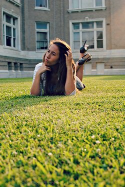


![[No title]](/data/xfmg/thumbnail/31/31705-3469470a562bc1a3bad361889544af19.jpg?1619734963)


![[No title]](/data/xfmg/thumbnail/37/37657-01deca3769b38b716838942ccbfce66a.jpg?1619738172)