LOGO/WATERMARK HELP

Nolan

TPF Noob!
Joined
Jun 2, 2009
Messages
246
Reaction score
0
Location
Toronto
Can others edit my Photos
Photos NOT OK to edit
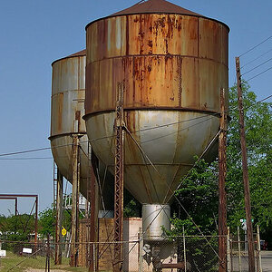
Hello,
I have been trying to come up with a logo/watermark for my photography for some time now and i am drawing a blank. None of my attempts in photoshop are satisfactory. This is mainly because i clearly don't know exactly i want, but i have a rough idea.

I need a logo that incorporates my first name, nolan, a bit about who I am/style and photography. Here are my attempts at this. They are all right, I think. But i want your opinion on them. Are they ok? Any suggestions or ideas for my logo/watermarks? Any help is welcomed!
nllogo.png

nolanlogo2.png
 
I need a logo that incorporates my first name, nolan, a bit about who I am/style and photography.

i'm not saying this in a scarcastic way, so I hope it doesnt come off that way..

when you were creating these particular designs, with the goal of putting "a bit about who I am/style and photography" what was it about what you chose, that made you choose it, and what are you trying to tell me about yourself with them?
 
I like the idea of the second one, but I think it could be executed a little bit better. I think it's the size of the viewfinderish box that turns me off.

But I'm also not a big fan of the font you chose for it either. I think in a design like that you need to stick with a very standard sans serif font with very simple clean lines, where as this one has a little flare with the pointy nature of the N's.

Just my two cents. But I really like the design idea behind the second one. I think you could make a great logo out of it.
 
thanks for the input. i'll revamp the 2nd logo soon with your suggestions and post it here.

By the way any more thoughts? The more the better!
 
Last edited:
well heres the edit. I changed the font to Helvetica, its more like a sans serif font. And made the view finder smaller.
Tell me what you think! Any recommendations on the font? I don't 100% like the new one.

By they way if you want to help me out, feel free to recreate the logo the way you would do it. I am interested in seeing alternatives.
nolanlogomark2.png
 
Last edited:
still trying to figure out what it says about you..
 
still trying to figure out what it says about you..

Sorry for not getting back to you soon.
My intentions are to make the logos reflect my self ideally. But I'm no graphic artist so i found that very hard to do. So i went with the easy path of creating a modern logo vs that.
 
i like the size of the second version better, but i prefer the font of the first version of the second logo. its really crisp and clean. i think, as mentioned above (but at the opposite end of the spectrum), sticking with an ordinary font makes you come of as...ordinary. a good clean font can say a lot, and thats what i get from the first version of the second image.
 
I threw together a quick version of the second design. See what you think of it. If you like it or would like to have it I'd be happy to send you the large size 300dpi .psd file.

nolanf.jpg
 
Every thing you design, whether you are a graphic designer or not, has to have a purpose.

The idea of the logo is simple, which is good, it gets the message out that you are a photographer.

The font of the first one with the sharp N is a lot more powerful. Overall, the logo is well done. The only criticism I would give is that there might be too much extra space at the top of NO

What if you reversed the colors? make NO AN gray, and the viewfinder black? Just a thought...
 
Conceptually the second one is very clever.
 
Every thing you design, whether you are a graphic designer or not, has to have a purpose.

The idea of the logo is simple, which is good, it gets the message out that you are a photographer.

The font of the first one with the sharp N is a lot more powerful. Overall, the logo is well done. The only criticism I would give is that there might be too much extra space at the top of NO

What if you reversed the colors? make NO AN gray, and the viewfinder black? Just a thought...

Thanks for the input. When i get some time tonight i will pull up the psd file and add your suggestions and see what happens. I'll post the results here when i'm done.
 

Most reactions

New Topics

Back
Top