making colors "pop"- GIMP

Thank you every one for such great advice!!!

Unpopular -- thank you for such detailed explanations. The tips combined with the how and why are awesome! I posed what I thought was a simple question, but thanks to you, I have a much better understanding of color. Probably what my art teachers have been trying to explain all along, it just never clicked!

Sparky -- yes, unfortunately I realize all of that. I do use a RAW converter plug-in, so that helps a bit... but still doesn't change the fact that it's 8-bit. Has anyone heard anything about when that could change? I really don't understand HOW it hasn't, given that GIMP is FOSS. If I had that level of programming expertise, I'd take on the challenge ;)

Joe -- you remembered my name! LOL Thank you for posting the example. I couldn't think of the correct word(s) for pop, and it was a long day. I'm glad you were able to decipher!

Peano -- a fellow DMV'er! Thank you for your advice and examples.

I'll take everyone's thoughts and suggestions into consideration. You all have given me so many ideas to work with; I'm starting to feel a bit inspired again.
 
OK, so I am working on HSL decomp. It's not going so well lol

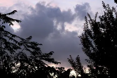
Original (long night exposure, aroung 10PM) $IMG_7421.jpg

On this edit, I decomposed to HSL. Selected curves tool and used "value" and recomposed to RGB. Should I be doing each RGB curve separately? $7421 decompose.jpg
 
GIMP decomp to various color models can be a tricky business. If you want to play with what Unpopular was suggesting take your photo and from the Colors menu select Components/Decompose then in the dialog that opens decompose to HSL.

GIMP will show you a strange B&W version of the photo and will default to the L channel as selected. You don't want to alter the L channel. Go to the Windows menu of your HSL image and select Dockable Dialogs/Layers. The middle channel is the S channel -- click on that one. Then you can access Curves and alter the S channel. The problem is you won't be able to see what you're doing. So you want to make a change and then write down what you did.

You have two options now to put it back. From the Colors menu select Components and if you select recompose GIMP will apply the change you made back to the original that you should still have open. If you select Compose then you don't want to change the color model to RGB. If you select Compose leave the Color Model HSL and you'll get a new image with the change applied.

Joe
 
If you select Compose then you don't want to change the color model to RGB. If you select Compose leave the Color Model HSL and you'll get a new image with the change applied.

Joe

That's where I went wrong. I composed to RGB, will try again with composing to HSL.
 
Peano's image I think does represent vibrancy, and actually the desaturated warm colors do help achieve this. If all the colors were equally saturated, you don't get that vibrant "pop" because more color elements must compete for our attention. By having a light, lower saturated subject against a dark, higher saturated background, you will achieve some sense of vibrancy. Vibrancy is not merely a global increase of saturation, it's an increase in saturation relative to some other element.

As for the colors being inaccurate, I don't really mind that. Because we're dealing with "vibrancy" and not absolute saturation, there is some interpretive representation. In this case, the sky is represented as "bluer than blue", even if it's not objectively accurate.

I was referring to the fact that the color of the sky was shifted red which is certainly not a case of "bluer than blue" and I'm not aware of any definition of vibrant that involves altering the Hue of a color. I have also never before encountered this definition of vibrancy: "Vibrancy...., it's an increase in saturation relative to some other element." I believe that's uniquely your own.

Joe
 
Perhaps it is uniquely my own, in college I thought a lot about the issue of "vibrancy" and may have confused my own theory on the topic with established ones. I'm also pretty enthusiastic and opinionated - a dangerous combination, I know.

But we do perceive vibrancy, and often it's something other than simply increased saturation. What makes something "vibrant" is very complex, and I believe can include hue. In this example, there is the same green relative to two equally saturated, equally bright hues. However, one green patch appears more "vibrant" than the other:

$Simu.jpg

(it may help to cover one or the other with your hand so that they do not influence one another)

So really my definition of vibrancy being strictly relative saturation is incomplete. However, vibrancy relies on the appearance of saturation relative to other elements within a composition.

---

I took a look Peano's example, which you said was shifted redder. This didn't make sense to me, because if it were redder. Actually, Peano's example has an almost identical hue. Actually, according to my measurements, your version is about 9.4° "Redder". The two are also similarly saturated. This leaves only Value, Peano's edit is significantly *darker*.

This is a good illustration of how changing luminance affects the perception of color. Peano's edit makes the sky look more saturated and significantly more violet (which I perceive as "deeper" and "bluer than blue"). When in fact, technically your version is slightly more violet and nearly identically saturated.

---

On a similar, and humorous note - as I was typing this up, my wife smelled french toast cooking, and assumed it was the upstairs tenants. I only smelled a wild fire. When I went to change the my son's diaper, all she detected was the wild fire. :)
 
Here is another example of how saturation affects vibrancy. When considering this example, the point isn't that "pair A is more vibrant than pair B", but rather pay attention only to the orange swatch relative to the yellow swatch. In the examples at left, regardless of saturation, the orange swatch is nearly equally as vibrant as the yellow swatch. Our eyes are slightly more attracted to yellow, but for the most part each are equally dominant. However, the example on the right the orange is more dominant due to it being relatively more saturated than the yellow:

$Sat.jpg

Another interesting thing I am noticing is that my eye perceives the desaturated orange, and particularly yellow as almost greener, thus cooler.
 
Last edited:
Here, relative saturation:

$sat_cont.jpg

Note that only saturation is changed, despite that brightness appears to have been modified, giving the impression of tonal contrast. This can help preserve detail while increasing the perception of contrast.
 
Perhaps it is uniquely my own, in college I thought a lot about the issue of "vibrancy" and may have confused my own theory on the topic with established ones. I'm also pretty enthusiastic and opinionated - a dangerous combination, I know.

But we do perceive vibrancy, and often it's something other than simply increased saturation. What makes something "vibrant" is very complex, and I believe can include hue. In this example, there is the same green relative to two equally saturated, equally bright hues. However, one green patch appears more "vibrant" than the other:

View attachment 12477

(it may help to cover one or the other with your hand so that they do not influence one another)

So really my definition of vibrancy being strictly relative saturation is incomplete. However, vibrancy relies on the appearance of saturation relative to other elements within a composition.

---

I took a look Peano's example, which you said was shifted redder. This didn't make sense to me, because if it were redder. Actually, Peano's example has an almost identical hue. Actually, according to my measurements, your version is about 9.4° "Redder". The two are also similarly saturated. This leaves only Value, Peano's edit is significantly *darker*.

This is a good illustration of how changing luminance affects the perception of color. Peano's edit makes the sky look more saturated and significantly more violet (which I perceive as "deeper" and "bluer than blue"). When in fact, technically your version is slightly more violet and nearly identically saturated.

---

On a similar, and humorous note - as I was typing this up, my wife smelled french toast cooking, and assumed it was the upstairs tenants. I only smelled a wild fire. When I went to change the my son's diaper, all she detected was the wild fire. :)

I am familiar with the concepts of simultaneous and success contrast -- I teach color theory to college Art students. It is common when painters use sloppy language to slip the term vibrant in there to describe the perceived alteration in chroma that these effects produce. Technically and correctly artists use the term vibrant in reference to a color to indicate a high chroma value. The term vibrant is frankly questionably used by artists and painters -- it's a sloppy term with weak meaning that often produces just this kind of confusion -- for example it encourages people to invent definitions.

More practically we're dealing with a question related to photography where vibrant and vibrancy are recently and fadishly used and with even more confusion as to meaning. It's not a photographic term and shouldn't become one, but that's water under the bridge. A curse upon Adobe for the introduction of the Vibrance control in LR/ACR and CS4. It belongs in the Filter section. For what it's worth since Adobe has committed this transgression we can look to that adjustment for a contemporary definition. What that control does is selectively raise saturation of lesser saturated colors. To that extent vibrancy as practiced by Adobe means leaving highly saturated colors highly saturated and raising the saturation of the less saturated colors.

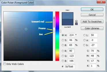
As for sky color above -- this is what I meant:

$hue_shift.jpg

The point isn't the direction or shift of the hue value, and I grant you it isn't major, but there's no justification for it relative to any accepted definition of vibrant. Chroma and value are linked but hue is independent of chroma. The white balance of the photo was altered unrelated to "vibrancy."

Even in the world of paint and pigments where we have the precise control to chose specific colors and their placement, simultaneous/successive contrast are esoteric topics at best and most commonly trotted out as a parlor trick. NONE OF THIS HELPS JESS who had a question about how to get results using GIMP. I seriously doubt that Jess started this post to discover how to add a simultaneous contrast effect into a photograph. If this thread is going to continue let's help Jess get results.

Joe

P.S. Stare at the center of the square:

headache.jpg
 
Joe - you are right, I read it backwards. GTG for now.
 
I appreciate everyone's help! I've learned more than what I asked about originally, but hey, that's not a bad thing :)
 
NOTE: Jess used the term vibrancy as well as Pop. Maybe I'm just and old curmudgeon but these non-photographic terms disturb me because they are undefined, sic. see above discussion. Photographers have a vocabulary that has been refined for over a century and it helps us identify what we're seeing.

New knowledge and new techniques expand vocabulary. "Vibrance" has been
in the Photoshop vocabulary for years, both in Photoshop and Adobe Camera Raw.

vibrance.jpg


I'm very aware of that. I remember when it showed up -- fortunately it hasn't made it into the higher quality software yet. Show it to me in Capture 1 for example. But I expect it will show up eventually. I'm not unrealistic, just disappointed.

By the way, what Vibrance actually does in LR/ACR isn't what you've been showing or advocating.

Joe
 

Most reactions

Back
Top