Dont know, Something about a woman sitting on a toilet just isnt sexy to me. And that would be this pictures main theme really. Looks like shes having some problems there.
I'm not sure what I think of the subject matter. Possibly it could be dealt with a littel less directly, but that's just my flavor. Looking at this in a cold, technical manner: I think it should be cropped tighter on the top and bottom, and something has to be done with the yellow cast.
I agree. Pshop it to get colors the way they should be. The back wall should be white, her hair should be brown. Everything is really yellow. I can try to pshop it if you want me too.
Not my kinda image, but I'd agree the yellowish cast adds to the unattractiveness of the image for me. B&W might add....something.
Please don't think I'm dinging your work at all, it's just not my flavah. I can't help but wonder about the conversations that would lead up to an image like this. :scratch:
Thanks for asking, but no. The walls are a yellow beige color partly because that's what color the paint is and partly because of the yellow light reflected off the walls of the stall. I never really intended it to be a pretty picture. It's more a commentary on a "bad girl" about to be caught being bad.
Possibly, but I am afraid I would lose the feeling of looking down on the subject, both litterally and figuratively. I was up to almost ceiling level in order to get that effect. My intention was a gritty "girl gone bad" feel and for the viewer to be in a position to look down at her in judgement.
Don't feel lonely, though. Very few people have liked this peice and those that do think it's my best work and don't care for my other stuff. I guess that in some ways, any strong reaction is better than no reaction.
Actually, the reason I mentioned the B&W is because I think it lends a more dramatic flair to the intent of this image. If that makes sense. Somehow the color makes it less compelling for me.
Actually, the reason I mentioned the B&W is because I think it lends a more dramatic flair to the intent of this image. If that makes sense. Somehow the color makes it less compelling for me.
Actually, the reason I mentioned the B&W is because I think it lends a more dramatic flair to the intent of this image. If that makes sense. Somehow the color makes it less compelling for me.
Ok. I came up with 3 different versions. Let me know if you like any of these or if you think it's still crap.
B/W: I also tweaked the contrast/brightness. 60% desaturated: Faded the desaturation and adjusted the contrast. Less yellow: Used selective colors to take out the yellow and make the walls more white.
Hmmm, until you said something about her "being a bad girl", I didn't even notice that she was going to graphiti; I just thought she was trying to look out of the stall, or being weird... Possibly having some writing, like she's half way through it, would help emphasize this.
Of course, maybe I should just pay more attention...
Heh. My original thought was to have her write "for a good time...", but all we had was lipstick and I was worried about how to get it off the wall when we were done. It's a public restroom in a school/artist's workshop kinda place.
I'm not good enough with photoshop to add it in without making it look obvious.
Good call, though. I agree that if I can figure out how to make it look good, it would really add to the picture. As is, it might be too subtle. Though it's an easier tell in the large format version.
I don't know if I can with that version (small jpg). That's about as dark as I could get it and keep her facial expression intact. I just did it to give people a quick and dirty idea of what it might look like in b/w.


 I can't help but wonder about the conversations that would lead up to an image like this. :scratch:
![[No title]](/data/xfmg/thumbnail/35/35263-86f580cf5d28d23109a45984030a79ad.jpg?1619736968)


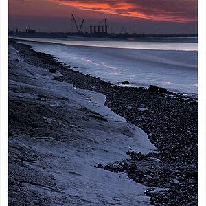
![[No title]](/data/xfmg/thumbnail/38/38262-10a9668da9a2b36a92cddde57caf87bc.jpg?1619738547)
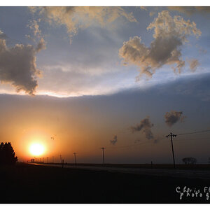
![[No title]](/data/xfmg/thumbnail/41/41892-d6f91fd1c816420825658ffaad56df78.jpg?1619739934)