c_lawrence
TPF Noob!
- Joined
- Feb 23, 2008
- Messages
- 71
- Reaction score
- 0
- Location
- Winder, GA
- Can others edit my Photos
- Photos NOT OK to edit
I had this posted in another forum & they suggested I post it here... This is my first TPF photo post...
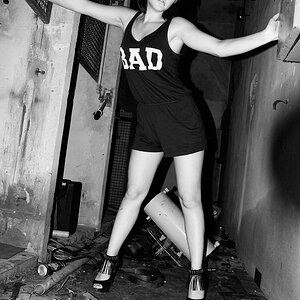
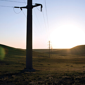
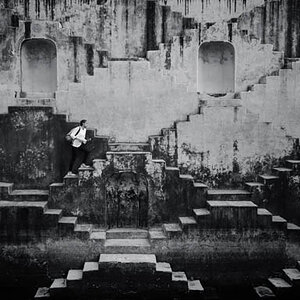
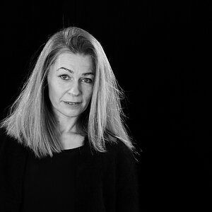
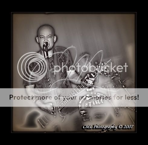
K - here goes... these are some of the images I am considering for a 'portfolio' website. I would really love comments and criticism (Be honest... the only way I learn!") ). I am planning on posting as is, so thoughts on the watermark are also welcome.
). I am planning on posting as is, so thoughts on the watermark are also welcome.
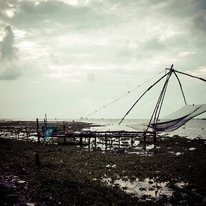
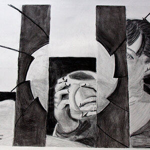
1.

2.

3.
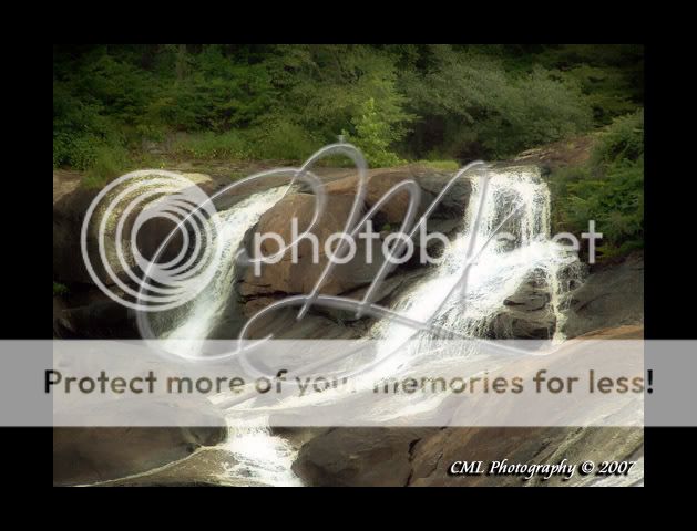
4.
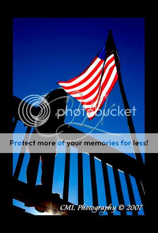
5.

6.
7.

8.

whew... that's it for now, let me have it! ;-)
K - here goes... these are some of the images I am considering for a 'portfolio' website. I would really love comments and criticism (Be honest... the only way I learn!
). I am planning on posting as is, so thoughts on the watermark are also welcome.1.
2.
3.
4.
5.
6.
7.
8.
whew... that's it for now, let me have it! ;-)