Pic #1
I'm not so sure about this one. The car seems to be the main focus of the photo and it seems, to me, pointless. Sorry to say, this one looks like a 'snapshot' to me.
Pic #2
I like this one and how the central leave looks like pure gold. Great lighting. The only bit I don't care for too much is the shadow on the left.
Pic #3
Intresting is all I can say. This one sort of looks like someone through the leaves in the air and they're free falling, or are they all connected to a tree?
Pic #4
This one is cool. It has the look of summer green in the forground and warm fall colours in the background.
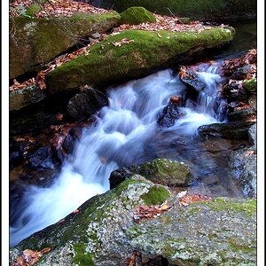
Pic #5
Excellent shot! I love how you did something different and did not centre the road. My only critique is the exposure seems off.
Pic #6
Another excellent shot. It's a bit different then the pic before. It's neat to see a curve to the "vanishing point". I'd like to see it a bit brighter, though.
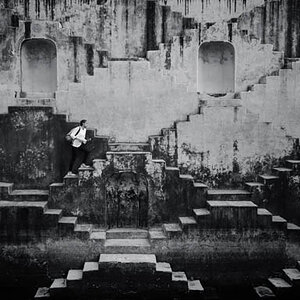
Pic #7
This one has to be my favourite. A neat kind of path. The over exposed look works too. Would have been cool seeing someone walking down the path.
Pic #8
Great colours, exposure, and DOF on this one. I'd loose the single twig though.
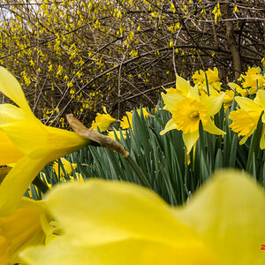
Pic #9
Cool idea. A lone leaf caught. It seems the leaf is out of focus though, perhaps a smaller aperture next time.
Pic #10
Those are some weird berries. Almost makes me hungry, not sure if they're edible though. Good DOF.
My immediate impression is: Photo 6 is really good.
But personally I also like Photo 4 for some reasons that no one here on the forum knows anything about, and that is alway why I would have liked to see even less blown-out sky in the background and more (and brighter) "foreground" and its "special LaFoto element" which I am not going to point out here .
Photo 8 begins to meet my "requirements" only do I find DOF a bit too shallow here.
1. the colors are kinda bleh and the pole to the far left makes the composition a little wonky. I think this would work better with a little post work, maybe make it black and white?
2. i don't like that shadow
3. some of the leaves in front that take up a lot of room are out of focus. The colors are kinda boring too.
4. too much contrast! nothing is in focus! D:
5-6. 5 is too dark, 6 is better. What is that thing in the corner??? I DON'T LIKE IT.
7. I LIKE THIS ONE. It feels just a pinch too bright and i think it would be AWESOME with just a little tonal adjustment. Sepia?
8. The hyper-contrasty colors are pretty in this one, but the focus bothers me a lot.
9. not feelin this one
10. YAY focus! The composition isn't perfect, but the colors are interesting, as is the texture. Then again, i don't really dig nature photos
I like much all in general, but I believe that there are some very similar. He would be aciert by your part to make a good selection, and this way the series would win in quality.
The 4th, 5th, 7th and 8th are my favorites. The 9th also seems very good to me.
I like much the color and the contrast of these images.
Greetings from Spain.

") .
.