ilyfel
TPF Noob!
- Joined
- Nov 8, 2007
- Messages
- 526
- Reaction score
- 0
- Location
- Wichita, KS
- Website
- www.myspace.com
- Can others edit my Photos
- Photos OK to edit
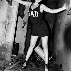
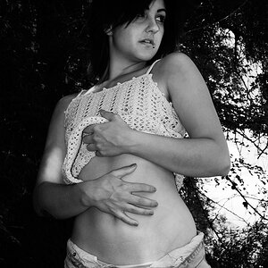
Let me fix what I said. I meant 2,3, kinda 4 not 1.
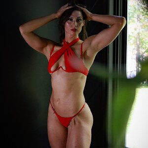
imho I think they would be better darker.
Also the model in the link and the model in your pics poses are NOTHING alike. It looks like she is stretching her shoulders back.. now if she would have done the pose in the link (less dramatic maybe) I would probably like it better..
imho I think they would be better darker.
Also the model in the link and the model in your pics poses are NOTHING alike. It looks like she is stretching her shoulders back.. now if she would have done the pose in the link (less dramatic maybe) I would probably like it better..
") When you said "any comments are welcome", that could mean critiques, good or bad comments, the latest stock tips, whatever. We didn't know what your intentions were with these photos, if you were looking for technical comments or just overall impressions. Here in the Professional Gallery, as you know, most people expect technical critiques.
When you said "any comments are welcome", that could mean critiques, good or bad comments, the latest stock tips, whatever. We didn't know what your intentions were with these photos, if you were looking for technical comments or just overall impressions. Here in the Professional Gallery, as you know, most people expect technical critiques. 
![[No title]](/data/xfmg/thumbnail/42/42451-9e2e4f1caad4c45d0c61e2a856140c36.jpg?1619740190)