CorrieMichael
No longer a newbie, moving up!
- Joined
- Sep 28, 2012
- Messages
- 447
- Reaction score
- 166
- Location
- Canada
- Can others edit my Photos
- Photos OK to edit
Follow along with the video below to see how to install our site as a web app on your home screen.

Note: This feature currently requires accessing the site using the built-in Safari browser.
Three issues;
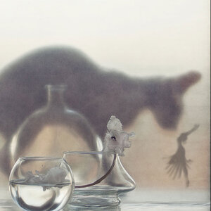
Having the model centered in the frame is bad enough, having her partially hidden behind the cauldron only makes it worse.
Your watermark.
Horizontal frame for a vertical composition.
")


#1. Move your watermark to a corner and reduce the opacity a bit so nobody b*tches about its location. I understand why it's there. But it is annoying where you've got it.
#2. Straighten the darn thing up. Whatever she's sitting on is leaning and it's driving me batty. And I would have liked to see the bottom of whatever it is (i.e. back away from her a bit) but that doesn't ruin this shot for me.
#3 - Straightened, and crops I feel improve the shot.
Off center:
Square:
As vertical as I could get it:
I like it, I like the concept a lot. The only thing I mentioned above that I *have to have* to call it a winner is straightening it, and maybe that's just me since nobody else mentioned it.
Ooooooooohhh ooooooh I like that square crop! And yeah, the watermark is a bit obnoxious. I KNOW you didn't intend it to come off this way, but it's placement really makes it seem like a noob-ish or pompous move, at least to me. And it distracts from an excellent image. Throw it down in a corner and then we'll all be happy [emoji106]
And to note, I absolutely love the lighting. So... Crisp. Was this artificial? Or just really really nice natural light?
Jake
Sent from my iPod touch using Tapatalk


![[No title]](/data/xfmg/thumbnail/31/31980-e5048a424621c7b3cd0d306d63c09d67.jpg?1619735137)
![[No title]](/data/xfmg/thumbnail/37/37603-739c5d9b541a083a12f2f30e45ca2b7b.jpg?1619738147)
![[No title]](/data/xfmg/thumbnail/42/42268-15c1c02cec1d71208987fc7c7ec7784c.jpg?1619740077)