Two ideas.... comments?

Which do you like better?


  • Total voters
    14

karissa

The Untitled
Joined
Mar 11, 2004
Messages
2,426
Reaction score
2
Location
Probably at work... *yawn*
Can others edit my Photos
Photos OK to edit
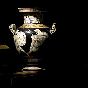
Ok, two different settings for same object. Which one do you like best and why?

#1
ring%20007.jpg


#2
ring2%20015b.jpg
 
I think they are both technically very good and I love the colors on the first, but the flower looks so good that it is almost distracting if I consider the ring as the main subject.

The second has a much more dramatic feel for me, which is why I voted for it. I'm curious what the 2nd would look like if the ring was a little closer and filled a bit more of the frame.

Enjoyed both of them!
 
number 1 for me. to me it tells a story.. a class ring on a fake flower would tell me something about the pretentiousness of high school or something along those lines. But thats just one interpretation, us humans like to add meaning to everything! I think its good because it lends itself to alot of intreptation!

from a composition standpoint i think both look fab.

:thumbsup:
 
WoW! Karissa your works and theme are awsome!
Oh! If I would have got a teacher like you ;)
 
Ok, I don't have lots of money but this camera was giving to me and I therefore LOVE it. I am using a CD Mavica 500 as it is sold standardly. For pict #1 I think I let it pick automatically. For the one with the black background I slowed down the shutter and don't remember how much. It was to long ago.. sorry. :-(
 
Based on my photographi experience (which is nill) I had to vote for number 2 because I found myself looking at the flower more than the ring.

Both shots are awesome though.
 
Thanks for your replies guys/gals. I really wanted to hear the reasons behind your choices because it helps to think about some of those things when you are getting ready to snap a shot. I really like to hear both sides because frankly I couldn't pick between the two. I think it really depends on what you where looking for it to say or do.
 
I voted for number two, but like Chase, I would do some cropping. I'd get rid of all the black at the bottom, since it's dead space and it's a bit distracting to have the brown end suddenly. I'd also come in a little on the sides. Maybe about a third of the way up the slope on the left, and then in enough on the right to have the space between the "L" in "school" and the "00" of the "2004" be the center. This would give the image some dynamics, rather than having the ring completely centered in the image. Porbably come in a little at the top, too.

The first one doesn't hit me. It's very well done technically, but I don't see much of a relationship between the two objects. It's sort of a "this looks neat" photo. Nothing wrong with that; we all like to take those. It's just not one that my eyes would linger on or study. I'm not saying that you shouldn't have taken the picture, but maybe try a few more and see if you can find a way of having the two relate to each other in a more universal manner. I like the idea that vonnagy hit upon. Maybe try and find a way to make that connection more obvious? Dunno. Just an idea.
 
I voted don't like either one, but only because I think if you are trying to feature the ring, it would be better off on a neutral background, and filling the frame much more. I don't know, are you trying to really feature the ring, or am I assuming too much? :p

I really like the first shot however, aesthetically, and artistically :)

Perhaps you could build a light tent and a nice bright white background to accentuate the silver.
 
Digital Matt said:
I voted don't like either one, but only because I think if you are trying to feature the ring, it would be better off on a neutral background, and filling the frame much more. I don't know, are you trying to really feature the ring, or am I assuming too much? :p

I really like the first shot however, aesthetically, and artistically :)

Perhaps you could build a light tent and a nice bright white background to accentuate the silver.

I complement your boldness. Actually, I took the pictures when I was learning to use my camera and at the same time experimenting with different angles and backgrounds and light and well... just flat out experimenting.

As far as I'm concerned you can assume as much as you want because I enjoy hearing your comments and points of view. I don't think I'm the only one learning from you.

So thanks again. :)
 
I like the second.....artistically because in the first, like the others have said, the ring competes with the flower..... and just personal taste, I really hate pink flowers. Or the color pink, really. Just me. It made the first image look sappy to me, while the second one had classic simplicity, more drama.

My two cents. signed, Hater of Pink :wink:
 
terri said:
I like the second.....artistically because in the first, like the others have said, the ring competes with the flower..... and just personal taste, I really hate pink flowers. Or the color pink, really. Just me. It made the first image look sappy to me, while the second one had classic simplicity, more drama.

My two cents. signed, Hater of Pink :wink:

I hate pink also! :cheer:
 

Most reactions

New Topics

Back
Top