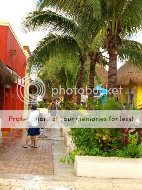
So I'm sure you have seen pics like these a million times...but they are some of my first with my camera..and I want to know if I am headed in the right direction. TIA
Can you help and tell me how to get that Mexican vibrant color...with out over saturating in post production? I mean what to do with my actual camera? It was so bright and beautiful there. TIA
1)Im new myself, but to me it does seem a bit over saturated, and to sharp.
2)I dont see anything interesting, and your focus is in the middle(trying reading up on the rule of thirds)
3)I dont know why but this is my favorite, I like the bright colors, except for the red building you should of tried cropping that out of scene. I think the saturation makes this photo 'pop'. The bushes in the foreground capture my eyes I like the bright green lush color. Maybe you could have toned it down just a bit
jajamo, not sure what kind of camera you were shooting with, but you can still get some color out of it without it looking too crazy. This is a quick 5 min. pp, which shows a little color without it looking like a cartoon. Of course it's not great ... but it's all I could work with considering 5 minutes and an oversaturated shot.
jajamo, not sure what kind of camera you were shooting with, but you can still get some color out of it without it looking too crazy. This is a quick 5 min. pp, which shows a little color without it looking like a cartoon. Of course it's not great ... but it's all I could work with considering 5 minutes and an oversaturated shot.
This is the original and I thought it was not bright enough...I'm hoping with practice my eye for color will get better. I really appreciate you taking the time to edit it. Thank you. (my camera is an Olympus Evolt e-410)
Maybe part of the issue with the 3rd shot is the focus. From my screen, I see it as out of focus, which makes it more difficult to work with. When the sun is up, the shots are more 'harsh' also making it somewhat difficult to work with.
I like the composition of #3, maybe shoot it from closer to the ground next time, I try to shoot from more than one angle, you never know, until seeing it on the screen.
#1 The focus to me is the chases. next time try to capture more of them and less of the tree tops, they are not too interesting. Again I mention angle, angle, angle.
Maybe part of the issue with the 3rd shot is the focus. From my screen, I see it as out of focus, which makes it more difficult to work with. When the sun is up, the shots are more 'harsh' also making it somewhat difficult to work with.
I like the composition of #3, maybe shoot it from closer to the ground next time, I try to shoot from more than one angle, you never know, until seeing it on the screen.
On the first photo I would have pulled down slightly, stepped backwards or zoomed out to get more foreground objects, and the second you should have just got the sky or get the whole scene. it's like you did half and half of two photos
on the third, I like the original more. the green in the edited version makes it feel like you spray painted the scene. the tile appears to have been replaced tile with sand it's so far off.
learn how to get good exposure in camera and you'll get better faster. you'll be more comfortable knowing that your photos are most of the way there before you get home and you can focus more on composition.
Color wise, the original #3 looks better than the edited one. I might add a touch of saturation to it, but it looks fine as is. I didn't really notice it before, but now my eye can't help but look at the clone stamp disaster at the end of the walkway. I honestly can't believe I missed it the first time I looked at it. I'm thinking you can try to remove the people who are fairly easy to remove, but it might be better to leave them in than to remove them the way you did.
#1 could have been right cute. Don't be afraid to move things out of your image. Unless the green plastic table and chairs were chained down, you could have easily moved them. You also need to learn up on compositional elements. Those wood chase lounges are perfect for a leading line to move you into the frame, and provide an element of interest, and hint towards relaxation. I can tell, all you thought was neat were the trees, and you disregarded all the rest.


")


![[No title]](/data/xfmg/thumbnail/38/38261-db20f6f92ee8f0d4c5cf1536e308638b.jpg?1619738546)


![[No title]](/data/xfmg/thumbnail/37/37618-4cd08d553e4ce30fd49570b1ba8259f2.jpg?1619738152)
![[No title]](/data/xfmg/thumbnail/35/35264-5ade32b7036391926536661aeb7491c3.jpg?1619736969)
![[No title]](/data/xfmg/thumbnail/38/38263-ad5e4c9e677626ddb5b1e7cdf9ebe40e.jpg?1619738548)


![[No title]](/data/xfmg/thumbnail/32/32696-92b490fbf42036986e97d5e60ff2b35e.jpg?1619735599)