Wall

Tangerini

No longer a newbie, moving up!
Joined
Jan 31, 2007
Messages
2,886
Reaction score
2
Location
In my house :)
Can others edit my Photos
Photos OK to edit
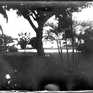
Here are three different conversions of the same photo... would you please let me know what you think?

lightsbw.jpg


lightsbw2.jpg


lightsbw3.jpg


Thanks :)
 
I hate to mix them up but I like how the light area is in the first photo and I like the brick area more towards how it is in the third photo(maybe a touch lighter though). Also have you thought about cropping out the area on the left side where the column is? Try cropping the photo at the line on the wall that runs from the top to almost the bottom to the right of the column. I think the focus of the image is the contrast between the brick, the cement and the pattern in the cement. That area with the column draws my eye to the outside rather that into the inside of the photograph.
If you want to know straight up photo 1,2 or 3. I'll say 3. It is an interesting photo.
 
Thank you for your input :)
I have tried different crops for this including the one you suggest, I suppose I'm partial to the detail in the left column and the scrolling... for me the photo is more about the texture differences and the placement of the string of lights as opposed to simply the differences between the brick and concrete.
I'm definitely interested in more opinions though, yours may very well be a consensus
 
It is interesting to hear your thoughts on what is important to you in the photograph. When I look at a photograph for the first time I first get a general feeling from it then I see where my eyes are drawn to. Finally, I look to see if that part of the photograph is what the photographer thought was most important or why the photograph was taken. In other words, in the composition or final print was what was important emphasized and what was not de-emphasized. By understanding your thoughts on the photograph that helps me quite a bit. Especially when it comes to a more abstract subject. I like it.
 
I think if it were cropped, like michaelk suggested, #2 would work best to show a big contrast between the black and white of the walls

but as far as showing a good both color and texture contrast, i would say 3 as well

i really love photos like this
 
I have no opinion about which of the 3. I do like the photo though. It's an odd mundane thing that many people wouldn't care to take a second glance of. Things like that are worth capturing.

This might have done even better as an HDR, giving you more dynamic range to play with in your conversion.
 
Thank you all for your responses :) I totally agree, jon_k, about photos of mundane subjects (obviously :lol:)
 

Most reactions

New Topics

Back
Top