ConverseAddict10
TPF Noob!
- Joined
- May 16, 2017
- Messages
- 20
- Reaction score
- 1
Follow along with the video below to see how to install our site as a web app on your home screen.

Note: This feature currently requires accessing the site using the built-in Safari browser.
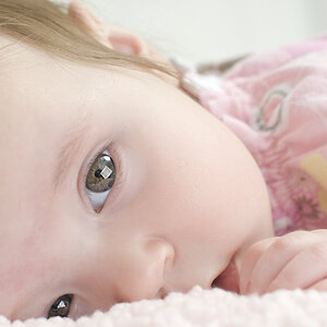
The conversion seems rather mid-tone rich, lacking any pure black or white and without contrast. A little more work there would have improved that aspect of it significantly. As far as the selective colour, the question you need to ask yourself is, 'Why?' Selective colour is really an advertising technique, NOT an artistic one (with rare exceptions of course), the purpose of which is to draw the viewer's eye to a particular component of a scene. In this case you have a photo of [I assume] your child, eating a slice of water-melon. WHY is the water-melon more important than the child? If you're selling water-melon, that's one thing, but as a photo of your child, with no emotional investment, I look at the image and all my eye really sees is the water-melon. You could have just as easily put it on a rock and left the child out of the scene altogether.
Selective colour can work in some shots and other it wouldn't, in this case it doesn't work for me
The selective color is distracting - his body seems OOF but in a way that makes him seem to be glowing. Too much space above his head.
Cute shot, however.")
I think you're a little lazy with the question. Since you didn't narrow it here we go.
Agree with above that I dislike selective colour but that is just an opinion so it's irrelevant to you becoming better.
What can help is to tell you what I like, why and where I think it can improve.
I like the idea of catching what appears to be a candid moment.
The overall shot to me feels more like a candid photo due to the extra room above the subject that really provides nothing to the photo. Just because it's candid doesn't mean we can't adjust it some. I would have framed the shot a little lower to show less background above the subject or shot in tighter to the hands and face.
Hard to tell from this photo but they focus does appear to be on about the same plane as the eyes or maybe the nose.
The mask used to create the selective colour is pretty rough. I'm not the best to answer how to correct this.
Oh ya. Welcome to TPF.
![[No title]](/data/xfmg/thumbnail/34/34057-a5a92fad5f5d96a5945d55a404b0cd27.jpg?1619736257)
![[No title]](/data/xfmg/thumbnail/34/34054-75057fa828bda4184ea808ff8bd8dfcf.jpg?1619736254)