What's new

100 Years

I'll bet this would look great in b&w too :P
 
  • Thread Starter 🔹
  • Moderator 🛠️
  • #5
I'll bet this would look great in b&w too :P

Hm, never even thought of it. Let's see:

$rs 100 years b&w.webp

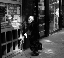
If I'm shooting in color, I generally don't even think about converting in post (unless I do something stupid like leave my yellow filter on a rangefinder :confused: ).

I pretty much love this!

Thanks :)
 
I prefer the color shot.
 
I like the story it tells and the elderly lady looks so cute reading the bulletin board. Color for me.
 
I love this shot, the lady herself appears to be a cute old gal, but to capture her reading a bulletin board about a computer and business skills program - priceless!
 
This is GREAT, but I would crop in from the right as I think much of that isn't contributing. Also, I think I might bring it up just a little as her body gets lost in the darkness and it took me a second to form my eyes around the image.

I'd show you what I mean... BUT... it says I can't edit your shots.
 
Actually, playing with it on my PC you can crop in a hair from the top and a bit from the right as well. It really brings the focus in on where it needs to be, and also beautifully isolates the word OPPORTUNITY on the door behind her.
 
hey! that was a pretty nice walk :)

color for me
 
love it!!
 
I would like to see some of the right-hand side cropped off, because for me, the single plane of the building front is the whole "deal", and the break in the front off to the far right hurts that. I would of course, leave in the discarded drink cup, and make the crop somewhere along the white highlight that runs top to bottom on the window. The line on the window is hurting it for me, and then the corner is not helping solidify her and the front of the building. That window highlight, the tall one, the line...that could be the border, or the crop could come inside of that, but I think the bright, small highlight on the window to the right of the line is distracting.

I think this might make a dynamite "square".

That cane! That hand! That hair! I see a whole 'nother level for this photograph if the body and darkness can be parlayed into a subtle shadow/highlight drama. THis is the kind of image that needs very careful, tricky printing/processing to pull out every last iota of goodness.

 
I think that people are reacting to the idea of the photo or what it might be rather than as it is now.

As it is now, her coat and most of her face is really dark with no detail, the highlights are too bright to see (her hand being the brightest part, the right side past the post is excess and draws the eye away.
If this were a print, a good lab would have fixed all that; it is digital so the 'fixing' is in your hands.
 
Last edited:

Create an account or login to comment

You must be a member in order to leave a comment

Create account

Create an account on our community. It's easy!

Log in

Already have an account? Log in here.

New Topics

Back
Top Bottom