What's new

100 Years

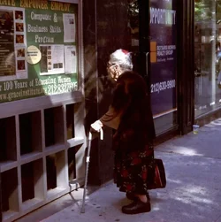
I think that people are reacting to the idea of the photo or what it might be rather than as it is now.

As it is now, her coat and most of her face is really dark with no detail, the highlights are too bright to see (her hand being the brightest part, the right side past the post es excess and draws the eye away.
If this were a print, a good lab would have fixed all that; it is digital so the 'fixing' is in your hands.

I agree: I see this as a work print. The Exhibition Print would be a bit different. There is more "in there", in that frame, than the high-contrast current incarnation is showing us. I think it needs some careful dodging and burning in. Even some of the funky Instagram filters, which are basically dodges-and-burns, in odd combinations, would stand a chance of revealing some more "Ah-hah!" feelings. I see in this image a lot of open shade/highlight relationships, which can be tricky to render optimally. I think the blacks are too compressed, and the mid-tones too close to the highs. This is the kind of photograph that's not only about the subject matter, but it also has a lot to say about the lighting that was there at the time. For me the cane, hand, and hair are big stars, but the cup, and the sidewalk puddles of dappled highlights are also interesting.

I'm actually pretty enthused about this shot, since it has a clever/interesting subject matter, but also very interesting and tricky lighting, so it's very different from the typical "open shaded side of the street", f/5.6 at 1/250 type of lighting so much street photography is done in.
 
  • Thread Starter 🔹
  • Moderator 🛠️
  • #17
Thanks everyone for the suggestions.

Interestingly, I did try a square crop. I didn't dislike it, but at the same time, I felt it might have taken too much of the context out. But I'm also aware that some of that context may be superfluous.

Here's a square crop as Derrel suggested. I also lightened the shadows a bit, and brought midtones and highlights down. How do we like it?

$100 years square.webp

I know that some want to see her body more, but one of the things I liked was that the things that mattered to me were in the light and I didn't care so much if her upper body was much more in the shadow. Her face is clearly lit, you can see the hand and the cane. and the case she's carrying. The flowers on her skirt are clear, too, and that's another main thing that attracted me - something frilly and girly to contrast with those sensible shoes.

And yeah, I like tricky lighting :)
 
  • Thread Starter 🔹
  • Moderator 🛠️
  • #18
This is GREAT, but I would crop in from the right as I think much of that isn't contributing. Also, I think I might bring it up just a little as her body gets lost in the darkness and it took me a second to form my eyes around the image.

I'd show you what I mean... BUT... it says I can't edit your shots.

I know, I know! But really, it helps me more if I'm "forced" to do it myself :) Thank you for the suggestions!
 
I might crop the right side some but I don't quite like it down to a square, took too much of the scene and the perspective away I think. I like it better in color, the B&W for this subject seems too stark.

Yeah, I'm usually thinking color or B&W before I even put film in the camera (or take along my digital camera) or a Polaroid for that matter - depending on where I'm going or what I'm doing. I haven't too often done a color shot in a B&W version.
 
This is an excellent example of why actually allowing edits would help.
This picture could be much, much better and no amount of pointing and suggesting will produce a final product as good as someone can make it who actually knows how to use PPing software well.

You may want the exercise of doing it yourself but the result is inevitably much less than what it could be if you let someone actually show you the direction.
Here's a book, go be a ballerina.
 
AWESOME AWESOME SHOT!! What a symbol, the changes that woman's eyes have seen, is she dreaming, "if only they had this for women when I was young". Oh BTW color for me too
 
It sounds like you guys are saying that Leonore can't produce a good final product. Yes sometimes a demonstration can work better than a verbal or written explanation, or a combination of various ways of telling and showing can work, it depends on the teacher and the learner and what's being taught. If she wants you to show an edit of her photo I'm sure she can ask.

And haven't we been thru all this before?? My background is in education, I know teaching methods, there's not necessarily just one way to do something. But it's up to the artist to create their own work or to decide how to use suggestions. I've taken grad level art courses (including B&W film photography and darkroom work). Even the instructor doesn't take over and rework your project, you do it yourself - they do demos and give guidance as to what you as a student need to do to improve or enhance your work (as well as what you're doing that's on the right track). They may show you on your own project a technique to try although I don't remember that being done much if at all. In a studio setting there's usually discussion among the students about what's being worked on, but nobody does someone else's artwork for them. It's up to the photographer how they want their finished photo to look.
 
I might crop the right side some but I don't quite like it down to a square, took too much of the scene and the perspective away I think.

Yeah, I don't think it needs to be square either.

This is an excellent example of why actually allowing edits would help.
This picture could be much, much better and no amount of pointing and suggesting will produce a final product as good as someone can make it who actually knows how to use PPing software well.

You may want the exercise of doing it yourself but the result is inevitably much less than what it could be if you let someone actually show you the direction.
Here's a book, go be a ballerina.

Yeah, I agree (big shock). There's nothing wrong with seeing what someone else does and then going to do it yourself. Just because they do it, doesn't mean you need to use that... or that you would agree with all choices... and, in fact, you'd be crazy to, since you have a low quality JPEG.
 
  • Thread Starter 🔹
  • Moderator 🛠️
  • #24
This is an excellent example of why actually allowing edits would help.
This picture could be much, much better and no amount of pointing and suggesting will produce a final product as good as someone can make it who actually knows how to use PPing software well.

You may want the exercise of doing it yourself but the result is inevitably much less than what it could be if you let someone actually show you the direction.
Here's a book, go be a ballerina.

Let's please not start this again.
 
lol
 
  • Thread Starter 🔹
  • Moderator 🛠️
  • #27
Neither do you.

Please don't start with the "Unskilled and unaware" argument.

I am perfectly aware that showing someone an edit is a valid teaching tool.
I am also perfectly aware that if I want someone to show me an edit, I can ask for one.

But what you're seeming to persistently ignore is that I know myself better than you know me. I know how I learn. I know what does or doesn't help me.

This is not a case of not knowing just how wonderful green eggs and ham really are if only I'd give them a chance. I've tried the green eggs and ham. It doesn't work for me. Neither does showing me an edit and then telling me the steps in software that you used. I've tried that method too, and guess what? IT WASN'T HELPFUL TO ME!
 
Last edited:
  • Thread Starter 🔹
  • Moderator 🛠️
  • #28
Oh yes, and I haven't forgotten the quieter voices :) Thanks everyone for the kind words and suggestions about color and cropping!

I prefer the color shot.


I like the story it tells and the elderly lady looks so cute reading the bulletin board. Color for me.

I love this shot, the lady herself appears to be a cute old gal, but to capture her reading a bulletin board about a computer and business skills program - priceless!

hey! that was a pretty nice walk :)

color for me

love it!!

I might crop the right side some but I don't quite like it down to a square, took too much of the scene and the perspective away I think. I like it better in color, the B&W for this subject seems too stark.

Yeah, I'm usually thinking color or B&W before I even put film in the camera (or take along my digital camera) or a Polaroid for that matter - depending on where I'm going or what I'm doing. I haven't too often done a color shot in a B&W version.

AWESOME AWESOME SHOT!! What a symbol, the changes that woman's eyes have seen, is she dreaming, "if only they had this for women when I was young". Oh BTW color for me too
 

Create an account or login to comment

You must be a member in order to leave a comment

Create account

Create an account on our community. It's easy!

Log in

Already have an account? Log in here.

New Topics

Back
Top Bottom