
Xanimal13
TPF Noob!
- Joined
- May 9, 2012
- Messages
- 14
- Reaction score
- 2
- Location
- United States
- Can others edit my Photos
- Photos OK to edit
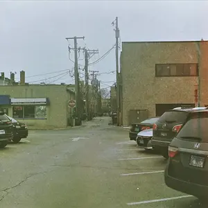
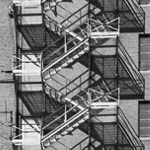
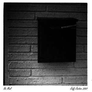
Went hiking around my town for a few hours last night and got a few shots I enjoyed. My biggest problem was the F on the free hugs, I wanted to show the alleyway but lost a bit of both in the end unfortunately 
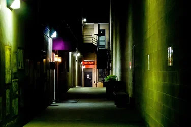
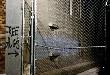

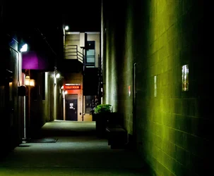


 The only thing I might have done differently is to lower the ISO and increase exposure. It's a bit too grainy for me, although that adds to the gritty urban feeling I suppose.


![[No title]](/data/xfmg/thumbnail/32/32631-60d0db057ee085953a0921e337396654.jpg?1734162116)







![[No title]](/data/xfmg/thumbnail/32/32929-22e23acc63d6ecb25e5ee941be87121f.jpg?1734162700)