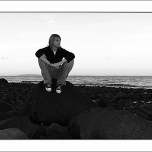
I took a few shots recently for my friend of her children. These were my favorites of the set, and I wondered if anybody was up for some harsh, honest C&C?
Beautiful kids (note: if you read this thread ababysean...leave that comment alone!!!)...you sure like that blur effect...you're awesome...great work...man...I'd hire you to take photos of my boys...
Thanks for the comments... I do like the blur effect, but it's a long steep slope learning to use it without also blurring your subject:blushing:
This was shot with all natural light, right around sunset. Overall, these were my favorites from the day.. but something just feels *off* in them to me, and I can't place it = \
As for settings.. I don't remember offhand, except it was probably around 250 ISO and f 1.6ish
I would have rotated the camera to portrait orientation on both shots, which would have put those cute young faces on top of "bodies". The first photo, of the boy, where the camera is angled down along the wall is a photographic compositional technique called "skimming". I think it looks pretty good when shooting along a wall, but the horizontal camera orientation does not work nearly as well as a vertical; the second photo of the young girl shows the problem with the horizontal camera orientation, in that there's a large percentage of the frame behind her which is basically empty brick wall, and which leads the eye directly away from her face. The masonry work's corner in the right hand background of the girl's picture is distracting. The boy's photo has the majority of the out of focus area in front of the subject, which is the traditionally expected look you get when skimming, while the girl's photo has mostly OOF areas behind her, and is not quite as pleasing I think as the boy's shot, due to the almost 50/50 split of the frame in her shot.
Camera height seems wrong on the girl (too high a camera position), but favorable on the boy.
I think they are both great....are my eyes fooling me?? It seems like the top right corner of your sons head is blurred..... But then again it's probably the sun on his bright blonde hair that is just fooling my eyes. Gorgeous pics!!!
You inspire me, I'm such a noob at portraits still I really have no true cc. Im working to gain clarity you have with the subject.
I think those are good shots.
I do really like the first one..I think the landscape way of shooting worked out great. As for the first one I do agree with Derrell that rotating the camera would have been better I think..it looks cramped because her head is just barely cut off.
Oh my gosh, I just turned on the computer this morning.. and you all COMPLETELY made my day, thank you so much!:goodvibe:
You guys are totally right about the second one.. I needed to get down lower to her level so I could achieve the same "look" as the first with her brother. She was much smaller, so I had to orient the camera downward, which made her look up, and gave the wrong perspective. As-is, this shot would be better in portrait orientation, I agree.
Thank you again sooo much for the incredible compliments! I didn't come here just fishing for warm fuzzies, in fact, quite the opposite... but to hear that these were great from other posters whose work I admire is just awesome! Thank you =)
Good background and lighting, I just don't like the blur in the first one from that aspect but it's not bad per se
you generally want their head pointing into the shot. that the direction of sight is inward helps but you're losing some of the energy you could have otherwise. this isn't something that necessarily detracts having not done it but I think it would help.
What I'm not a big fan of is the lack of color contrast, their faces really blend into the bricks from a color standpoint. a colored reflector, maybe gold to add a different tone, would help them stand out more.