What's new

2 for C+C and Business Card CC

damn Miss Cream.. i was getting ready to add your phone # to my phone but its not there! :lmao:
 
slight self-advertizing? haha its cool. not to be rude, im not a fan of that card, i cant tell what that pink thing is lol. i think if you had either leclick or your name instead of both, it would look better. unless you work for a company with more than one photog. but since you're good looking, i can overlook it ;) lol

Hahaha no I'm not self advertising, I wasn't even going to post the back of it but I did lol. The pink thing is my phone number I scratched out in paint lol. I really like the second one you posted!

Bitter, Yeah I thought it was a bit girly but then again, I am a girl. If I could do it over again I would change the pink.
 
IMO, neither is acceptable.

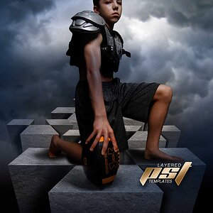
Product photography has got to be spot on. Are you suggesting to be a Sabres fan, a car enthusiast..... and what is on that card? Why is there such a discoloration in your background.

If the second is a business card, you may want to add some more information for your business. You may also want to take another stab at the shot.


EDIT I:
HOLY $HIT..... I only watched the last few minutes of VT beating FSU and I left my reply open..... and I was the first reply. Now I way down on the list.


EDIT II:
You changed out the first image. It used to be a lantern with a set of car keys attached.


Tarheels move on in the tournament....... :D
 
Last edited:
well i took down the lanyard shot. thats not the pic i meant to put up.

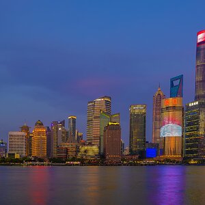
the first card has a fractal behind the words.

i like the second one a lot better. i was going to do something like that before but was unsure. I want to put my contact info on the back as well as my website. but centered and in plain black letters.

and im both.. a sabres fan and a car enthusiast lol
 
IMO, neither is acceptable.

Product photography has got to be spot on. Are you suggesting to be a Sabres fan, a car enthusiast..... and what is on that card? Why is there such a discoloration in your background.

If the second is a business card, you may want to add some more information for your business. You may also want to take another stab at the shot.


HOLY $HIT..... I only watched the last few minutes of VT beating FSU and I left my reply open..... and I was the first reply. Now I way down on the list.


EDIT II:
You changed out the first image. It used to be a lantern with a set of car keys attached.


Tarheels move on in the tournament....... :D


Do you grow your on, or just buy it from a reliable source? =p
 
From a design standpoint, it would be better to have all your info on one side of the card. I've found that just a simple black background, a nice and strong font for your name, and best means of communication with you will work the best. You don't need to be "flashy" to get your point across. If you do decide to go the 2-sided print job, it will cost more and probably not be as effective for marketing if you only have your name on one side.
 

Create an account or login to comment

You must be a member in order to leave a comment

Create account

Create an account on our community. It's easy!

Log in

Already have an account? Log in here.

Back
Top Bottom