Digital Matt
alter ego: Analog Matt
- Joined
- Jan 30, 2004
- Messages
- 5,358
- Reaction score
- 73
- Location
- Santa Barbara, CA
- Website
- www.mattperko.com
- Can others edit my Photos
- Photos NOT OK to edit
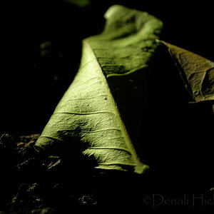
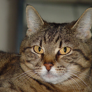
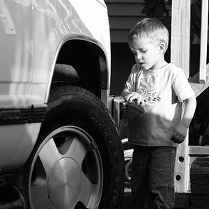
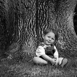
I had the opportunity to do another shoot this weekend with my good friend Dan. Here are just two of the over 300 shots I took.
I'd love to hear your feedback.


I'd love to hear your feedback.
")
![[No title]](/data/xfmg/thumbnail/36/36654-55e621bd8f3203cdd106e3764c553c4d.jpg?1619737673)
![[No title]](/data/xfmg/thumbnail/39/39498-362f11d9bfd0d9e222faa85b38801745.jpg?1619739056)

![[No title]](/data/xfmg/thumbnail/39/39497-93752210dd49247220721e5ac8c61245.jpg?1619739055)