DGMPhotography
Been spending a lot of time on here!
- Joined
- Mar 23, 2012
- Messages
- 3,160
- Reaction score
- 718
- Can others edit my Photos
- Photos OK to edit
So this was my second time shooting with Blair, would appreciate some C&C!
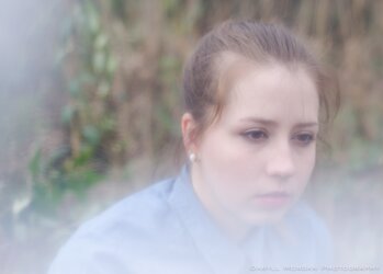
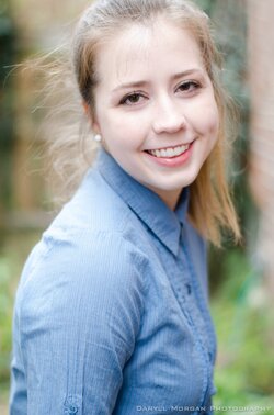
1. I did some experimenting with "filters." (Aka, plastic, flowers, etc). Check out my other thread for my favorite: http://www.thephotoforum.com/forum/people-photography/344721-magenta.html Personally, I know this photo probably breaks a few rules, but I just like the way it looks!
2. Classic over the shoulder pose. I think her posture's a little bit off though, and the background is a little distracting, despite shallow dof.

3. I told her to try to convey "defiance." I liked her pose. Again, not totally digging the background, but until I can drive and scout for some awesome places, I'll do the best I can with what I got!
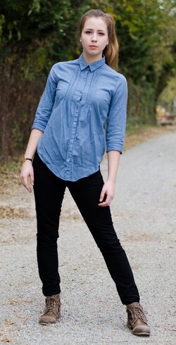
4. Artificial lighting here (flash to the left). I like the range in contrast.
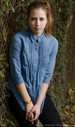
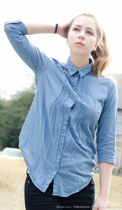
5. Honestly, this picture shouldn't look good at all. Took it in front of a random house, vehicle to the side, etc. However, with some cropping, I think it turned out okay, and I rather like the overexposed look in this one.

So, what do you think?
Thanks!
1. I did some experimenting with "filters." (Aka, plastic, flowers, etc). Check out my other thread for my favorite: http://www.thephotoforum.com/forum/people-photography/344721-magenta.html Personally, I know this photo probably breaks a few rules, but I just like the way it looks!

2. Classic over the shoulder pose. I think her posture's a little bit off though, and the background is a little distracting, despite shallow dof.

3. I told her to try to convey "defiance." I liked her pose. Again, not totally digging the background, but until I can drive and scout for some awesome places, I'll do the best I can with what I got!

4. Artificial lighting here (flash to the left). I like the range in contrast.

5. Honestly, this picture shouldn't look good at all. Took it in front of a random house, vehicle to the side, etc. However, with some cropping, I think it turned out okay, and I rather like the overexposed look in this one.

So, what do you think?
Thanks!



![[No title]](/data/xfmg/thumbnail/39/39181-9016b4d45a06d288c1a2b92565ba7837.jpg?1619738902)
![[No title]](/data/xfmg/thumbnail/35/35877-b537a0bce18fcb18b610d787610f3d3d.jpg?1619737203)
![[No title]](/data/xfmg/thumbnail/32/32433-abebb6cea0cf29d5f27d9054c7b0664e.jpg?1619735443)

