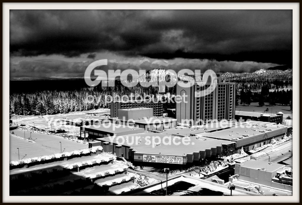
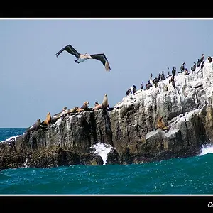
#1 and 2 are interesting, quite dramatic, I like threatening, strong skies. But I think both pictures run in too much contrast. Highlights maybe have too many details "jumping" forward and "stealing" a lot of attention. I love in #1 the gently swirling grasses which would be in perfect harmony with the sky, but in between is this blinding, very busy with boulders beach. To my feelings it is an overload, two so different visually and emotionally subjects put together. In #2 very similar story, fore plan very rich in detail which is forcing its way right in the eyes, but that just regular concrete landscape. It is taking away the attention from the real beauty of the nature in the background, the storm seems so far away. When I cut off 1/3 from the bottom I could see a very different picture (emotionally).
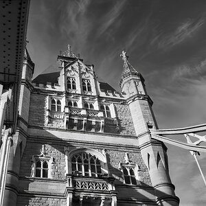
#3 has nice tones.








![[No title]](/data/xfmg/thumbnail/31/31085-9786bf0c16c072633ecdfad477c23095.jpg?1734159197)



![[No title]](/data/xfmg/thumbnail/34/34556-60d61b1903f6554f7373cddfe5823280.jpg?1734165526)
![[No title]](/data/xfmg/thumbnail/41/41930-3f8741ecabbbfd4d67ade3e339078814.jpg?1734176287)

![[No title]](/data/xfmg/thumbnail/42/42277-63576745f84be96df79b94ca0f49e00b.jpg?1734176687)