
ottor
No longer a newbie, moving up!
- Joined
- Feb 7, 2009
- Messages
- 935
- Reaction score
- 173
- Location
- S. Idaho
- Can others edit my Photos
- Photos OK to edit
Tossing some out and thought these were worth saving - your review and C&C is appreciated... (You know what they say about "In the eye of the beholder"...)
thanks, in advance, for your comments...
r
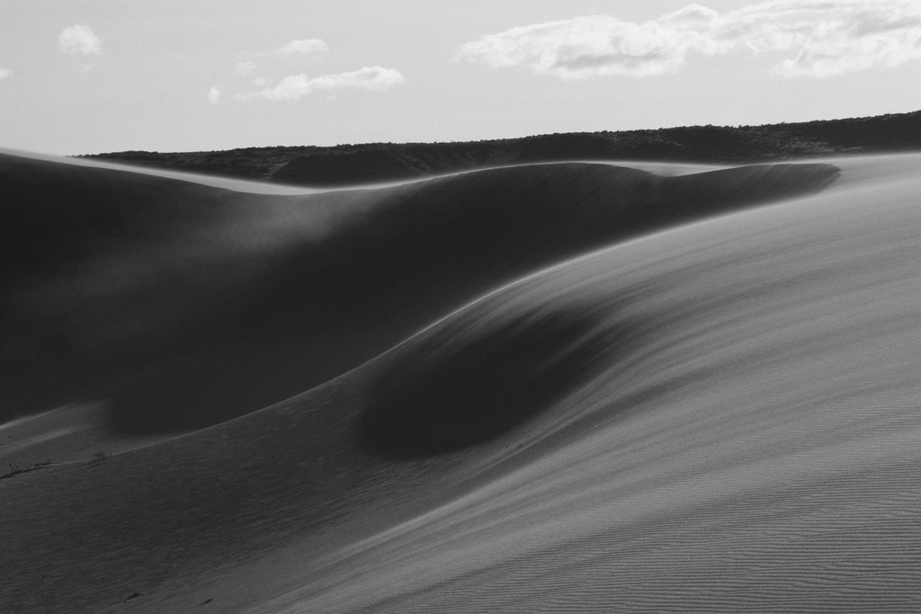
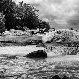
1.
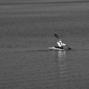
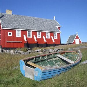
2.

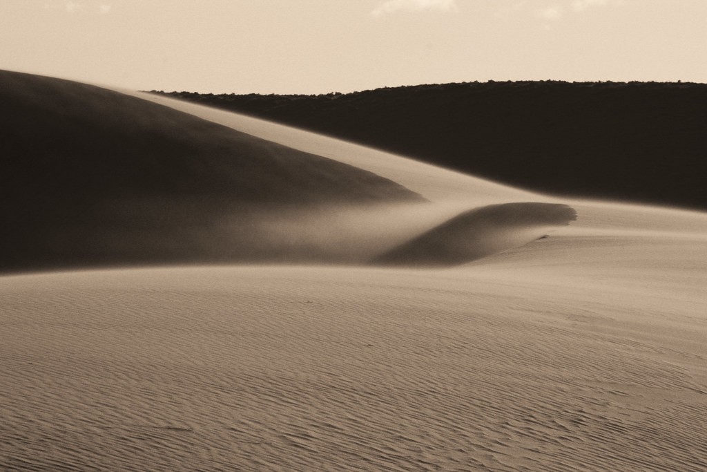
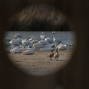
3.
thanks, in advance, for your comments...
r
1.
2.
3.
") but I do like 1 & 3, I really like the brushed look of the sand -almost like its blowing. As Samanax mentioned though with #1, the horizon is slanted.
but I do like 1 & 3, I really like the brushed look of the sand -almost like its blowing. As Samanax mentioned though with #1, the horizon is slanted.![[No title]](/data/xfmg/thumbnail/32/32717-74f4cee577117aa4476c9eb68fec51c7.jpg?1619735622)
![[No title]](/data/xfmg/thumbnail/38/38722-8003d9d84f1c7164b5c8f2b884c2e428.jpg?1619738702)


![[No title]](/data/xfmg/thumbnail/37/37126-93feffeca0e9e6ad893962c03a7a341e.jpg?1619737884)
