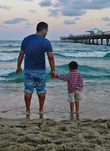
I ike the first one, maybe a tighter crop on it. A little off the bottom and the right side.
#2 works ok for me, but my eye keeps getting drawn to the poor area of cloning on the guys left side.
#3 gives a slight hint of wonderment in the child. Needs the exposure and color balance adjusted a bit, also just a bit tighter on the crop might help it really work.
I ike the first one, maybe a tighter crop on it. A little off the bottom and the right side. #2 works ok for me, but my eye keeps getting drawn to the poor area of cloning on the guys left side. #3 gives a slight hint of wonderment in the child. Needs the exposure and color balance adjusted a bit, also just a bit tighter on the crop might help it really work.
Yeah I'll be fixing that clone job just a test run to get them up here. I tried a tighter crop on the first photo, but without the added foreground it made the scene rather flat.
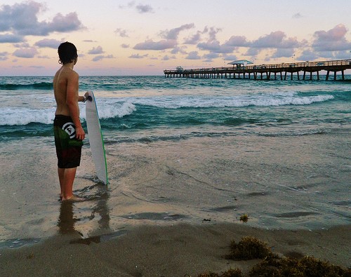
I didn't have a real good gray target on this one so I used the same correction I used on the first one. On the first one I used the back of the surfboard which I assumed was white (or gray in the darkening light).
I don't use Photoshop, I use Nikon Capture NX2 so it's probably a different process. NX2 has the ability to place a gray point anywhere on the image and it will correct the color of the entire image so that the selected point is gray. It also has white and black points as well. I don't know how you would do that in Photoshop or Lightroom though.
I actually like the dark. It leads a telling story. Did he miss the tide? What is he looking for the future? Maybe one day I will get there too. These aren't readily available when I see it touched up lighter.
I like the first one but I don't care for the overall blue cast. I realize it's an evening or early morning shot and the blue may have been what you were going for. I Took the liberty of correcting the color. If you don't care for it that's fine to because honestly I'm not sure whether I do or not. I left it kind of dark and moody though.
")
 just a test run to get them up here. I tried a tighter crop on the first photo, but without the added foreground it made the scene rather flat.