My edit
")
It still has a sense of darkness, but much better exposed and less contrasty IMO. I like it
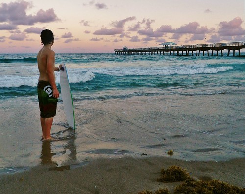
 surfer
 by
blackrose1981, on Flickr
This thread has been superb!!!! GREAT re-works and sharing of ideas and opinions. As far as this edit in post #31 goes: it all looks too "green"....sand, water, and the boy's skin has green undertones. Some of the earlier edits show the sky a different color, and the sand and water differently and I prefer the colors of the earlier edits, although the first one offered was a bit too dark for my taste. As to the comment about east coast "blue and purple"...I think that is more a matter of how your camera reacts to twilight-time light...white balance adjustments can make a HUGE, huge difference in how a camera records images. What I see blackrose in your originals is a bit of an "As-Shot WB" look that overly-emphasizes early evening light, and MAKES IT LOOK TOO blue, or too green, or too-monochromatic. Blue-toned images do convey an "evening" feel to many viewers.
Here is something I think is fun to do: set a pre-set white balance off of a white-painted chair, or a white plastic lawn chair that is QUITE WHITE in appearance, and do it in open shade, about three hours prior to sunset, in the location you will be photographing, and then use THAT pre-set WB as the one you make images with...
There's nothing worse than an AUTO-WB camera trying to cancel-out the lovely pinkish hues of the morning sky, or canceling out really beautiful lighting that comes right before a storm, etc., etc..


![[No title]](/data/xfmg/thumbnail/37/37110-1d5d98524f9f6a8623703161610ef439.jpg?1734169830)


![[No title]](/data/xfmg/thumbnail/35/35948-700e0d840da0ca73727b1bd6d99b4142.jpg?1734167751)