3 of the smae but which one??

MohaimenK

TPF Noob!
Joined
Nov 13, 2008
Messages
2,583
Reaction score
11
Location
In between her...
Can others edit my Photos
Photos NOT OK to edit
I personally like #3


IMG_7382DS.jpg


IMG_7382CS.jpg


IMG_7382BWS.jpg
 
number three is a little to bright for being b&w i like number 2 the best
 
Number 1. I agree that number 2 looks over saturated, but not a lot.
 
BTW guys, all edits were intentionally done that way. Just to get those looks.
 
#1, but I have a very heavy bias towards desaturated images.
 
#3 if I had to choose. #2 looks like bad self tanner and #1 looks like she wasn't feeling well IMO
 
BTW guys, all edits were intentionally done that way. Just to get those looks.

The overexposed face look?

Yes sir. I wanted it. The original image is fine as far as exposure. I raised the brightness on it twice, with different layers.

Kindda wanted this effect but in B&W. Maybe it would have looked better in the 1st version, and raising the exposure on that.

This is what I was going for:
http://mostlylisa.com/wp-content/uploads/2010/05/overexposed21.jpg
 
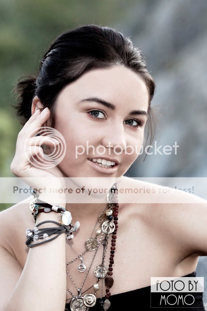
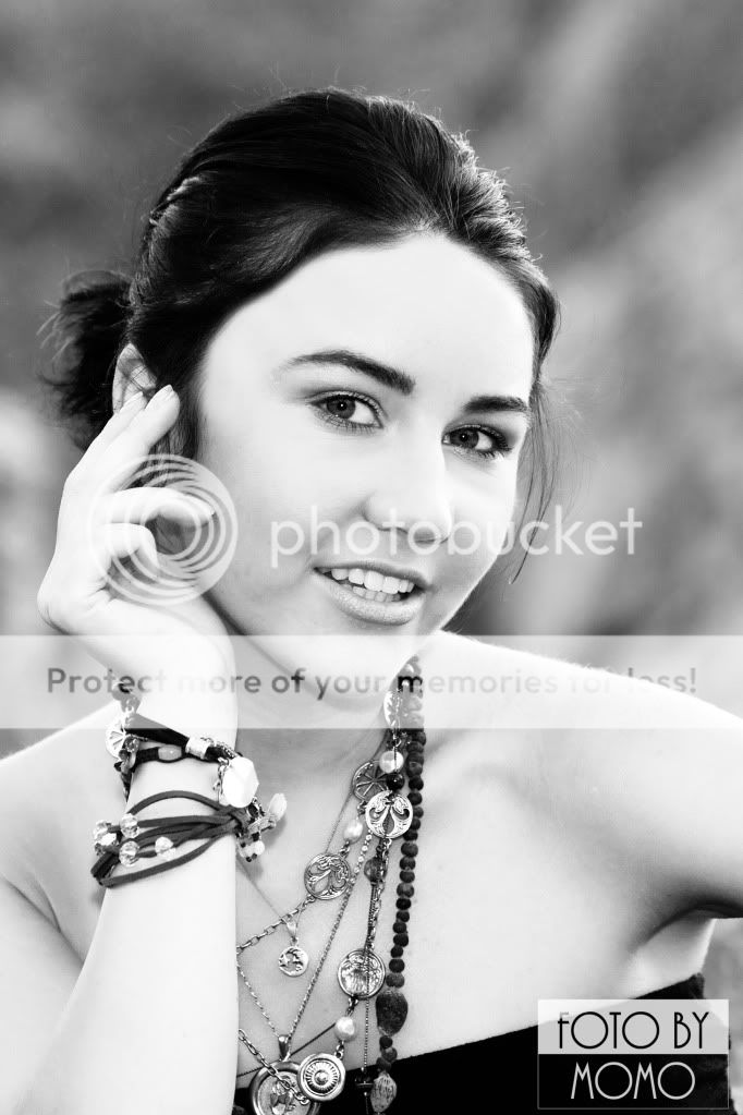
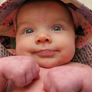
1st one looks to pale for me, between the 2nd and 3rd I like the 2nd, seemingly more natural BUT I think the B&W would have been top choice is the face wasn't overexposed. If that's the look youo're going for though it seems a bit too bright in this case though.
 

Most reactions

Back
Top