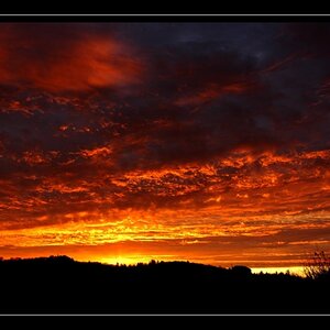
suprizingly they looked like that before i messed with anything, not as bad, but still more contrast than i was used to. i tried not to **** with the contrast much more becuase of how they came out in the first place.
suprizingly they looked like that before i messed with anything, not as bad, but still more contrast than i was used to. i tried not to **** with the contrast much more becuase of how they came out in the first place.
So what is the blue around the bottom of the second one? And the extreme blue and pink in the last one. I was thinking exactly what fightheheathens said.
I like #1. It's kind of a neat effect, accept for all the white splotches on the right hand side.
i dont see the blue in the 2nd one except the sky. and the extreme blue and pink was the lighting on the building there was spotlights and crazy lighting there. that's why i took the picture, the colors were so intense to begin with. thanks for the tips!!!!!!
I like the first one a lot at first glance, but after staring at it for a minute, it just looks way too ps'd. would like to see what it looked like b4 the playin'. Don't get me wrong, I still like it.
Well, I'm not too keen on the composition and choice of background in the first.
The deeply saturated fire box with its peeling off paint offers enough in texture and other little things to see that it would merit a photo of its own ... filling the frame.
All of these tend to look oversaturated at first, but after a while, they start to grow on me and I like the intense colours in the second and the focus, and I see why the colours in the last attracted you and made you take this photo! They are quite, quite crazy to begin with...


")

![[No title]](/data/xfmg/thumbnail/42/42484-fe2beb05d743deaf21681664722538d4.jpg?1619740195)

![[No title]](/data/xfmg/thumbnail/33/33875-e155733428c9a8d5f34bbc19e80e29a6.jpg?1619736181)