3 Shots From Today ( C&C PLEASE! )

robertandrewphoto

TPF Noob!
Joined
Sep 1, 2009
Messages
222
Reaction score
6
Location
South Jersey
Can others edit my Photos
Photos NOT OK to edit
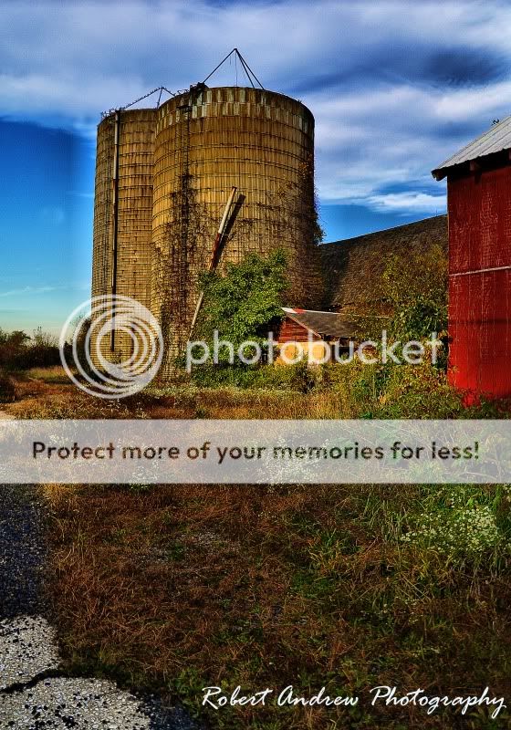
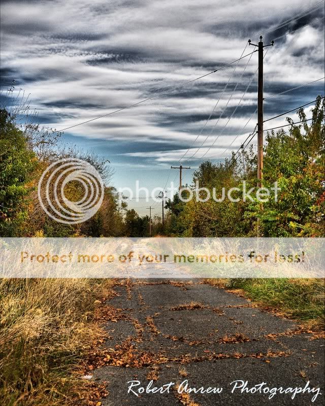
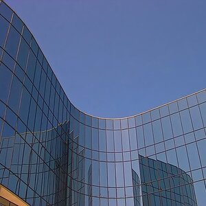
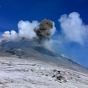
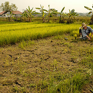
Just a few shots from these farms around my house.

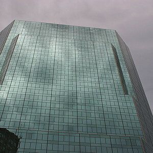
All shots taken with a tripod, 2,0,-2

Please C&C!


1.
FarmVIVID.jpg


2.

TowerVIVID.jpg


3.

WalkwayVIVID.jpg
 
man the silos in the first really pop out and look good!
 
#1. The sky looks a tad blownout to me. Compositionally, a little blah.
#2. There's an odd half halo on the side of the furtherst silo. My favorite of the set.
#3. Powerlines have an odd glow around them. I suppose that's from the HDR effect?
 
None of these images require HDR... they could all have been accomplished with 1 exposure and then burning, dodging, saturating, and calling it a day... That being said, the barn, grass, and blue silo in the first one look way too saturated for my taste... the HDR halo around the tree on the left also bothers me. It leaves something to be desired compositionally as well. The second one has too much dead space on the bottom. I'd go for a tighter crop. The composition is not awful, but there's nothing terribly interesting in the photo. it's also getting the HDR halo, which is distracting. I'd love the third one if it weren't for the power lines and the weird HDR effect... it just makes some of the foliage look unnatural... maybe that's what you were going for.
 
I like all three pictures they are not bad, however you did ask for comments so here goes the

1st picture has potential the sky could've been a lil more blue and perhaps a little bit more on shadow increase using photomatix. The grass color is over done.

2nd seems good exept as someone mentioned there is a border of some sort around the silos.

3rd everything looks good exept the power lines have a shadow border around them and there is some noise towards the end of the road up at the skylight.

but hey as mentioned what matters is they are good shots and I liked them
If you have yahoo messenger add me Provo_tc good work overall
 
Last edited:
#3 is my favorite! It's a very nice composition and the empty road really adds a nice mood to it. I think you should try tone mapping it again though, with less processing, and maybe also try adjusting the color of the sky, I think it's a bit off. Other than that great shots.
 
#3 also appeals to me the most. I actually think that a black and white treatment would be amazing with this photo furthering that abandoned/deserted feel.
 
thanks everyone for the comments, this one kinda stood out though

None of these images require HDR... they could all have been accomplished with 1 exposure and then burning, dodging, saturating, and calling it a day.

thats very true, but taking a multiple exposure shot is just as simple and a lot less work in the editing process honestly.

tone mapping is a lot easier then dodge and burn and has a better feel to it
 
I agree that it is easier, but it definitely doesn't have a better feel to it. look at the photos. Yours have a very surreal feel to them, and it doesn't accomplish anything in the photo. They are well lit scenes, and would look much better in my opinion with a single exposure. Just my two cents.
 
I agree that it is easier, but it definitely doesn't have a better feel to it. look at the photos. Yours have a very surreal feel to them, and it doesn't accomplish anything in the photo. They are well lit scenes, and would look much better in my opinion with a single exposure. Just my two cents.
+1

and the halos are indicative of pushing it too far.

I agree, the halos let you know that it's getting to the point of being overdone.

#1 - The grass looks too saturated and distracts the eye from the rest of the image. You can either tone it down or, alternatively, play around with the sky and try too add a bit of contrast/tonal range there (unless, of course, you do not want the viewer to focus on the sky)

#2 - I absolutely love all the texture here and the colors work perfectly as well. My only complaints are that eerie glow around the silos, as well as the composition of the photo. You could correct the former without sacrificing the great color by using some simple smudging in PhotoShop. To adjust the latter, you might experiment with cropping the bottom until right above the splotches of white/beige gravel (on the bottom-left).

#3 - I am a very big fan of this photo and the only thing that could use some adjusting is that glow around the cables. But compared to the photo as a whole, it's a relatively small complaint. The sky is wonderful, the texture of everything is also great, and the mood makes it stand out among the other two photos you have here.

Very nice work, though. I would enjoy seeing more in the future.
 
I like #3 very much. The first two are too saturated and somewhat boring.
 

Most reactions

New Topics

Back
Top