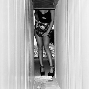
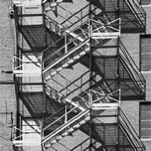
I'm not sure why people on a beginner forum give criticism that is harsh and directionless. What's boring to you might be interesting to someone else. In any case, unless you explain why you think an image is boring (or interesting, or good, or bad, or why you like or don't like it) your feedback is meaningless.
Yes, all of the images need to be straightened, and that's an easy fix, but an important one.
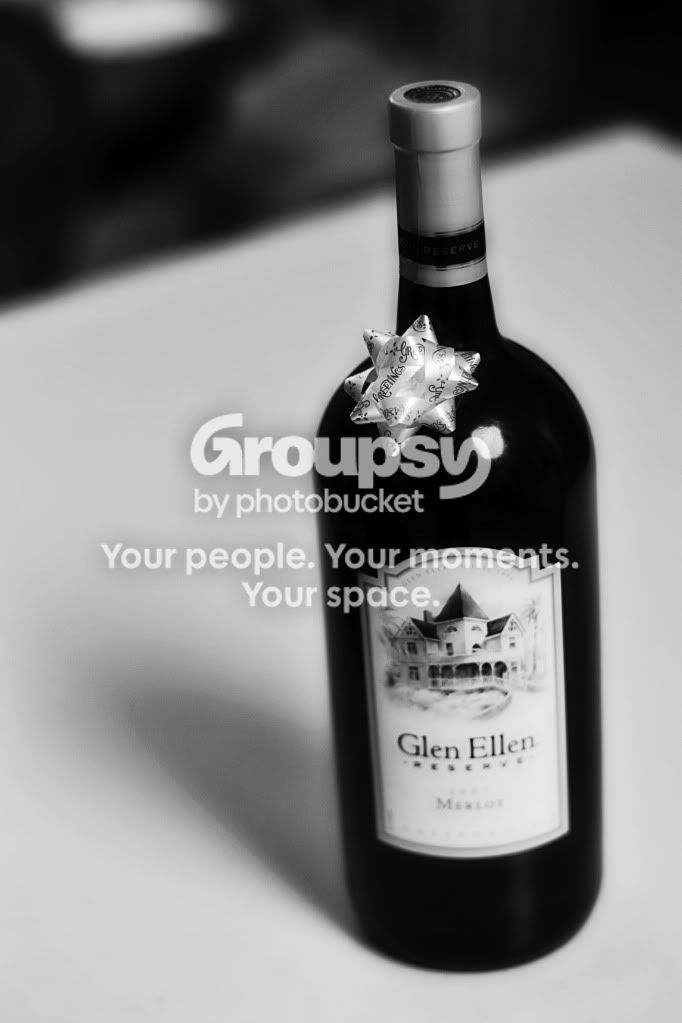
#1 This image has good contrast, but it is blurry. It looks like you focused on the ribbon, but the clean lines of the black bottle would look more visually appealing if they were sharper. Try a narrower aperture.
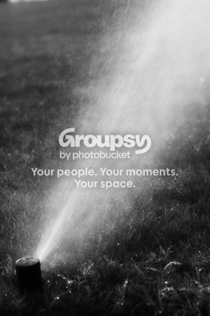
#2 This image has a great deal of energy and dynamic movement. However, it has little tonal variety. One way to achieve this might be to use a faster shutter speed. More space will appear between the droplets.
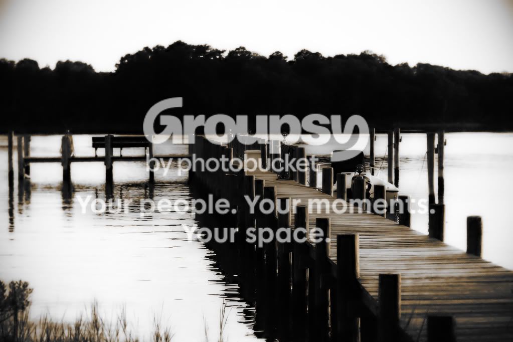
#3 Does look over-processed, and perhaps it is trying too hard to achieve something. It seems like too much of a departure from the original image. Perhaps too much of it sinks into blackness, the left side is blurry and confusing, You could provide more texture by setting up an off camera flash a few feet to your left to pick up the shapes of the posts.





![[No title]](/data/xfmg/thumbnail/39/39447-6e7679723d775935851f055bae9712ba.jpg?1734173538)
![[No title]](/data/xfmg/thumbnail/32/32706-50b778fbc110c8ea4472547d54c6a923.jpg?1734162290)