spacefuzz
No longer a newbie, moving up!
- Joined
- Jan 18, 2011
- Messages
- 1,832
- Reaction score
- 318
- Location
- Southern California
- Can others edit my Photos
- Photos OK to edit
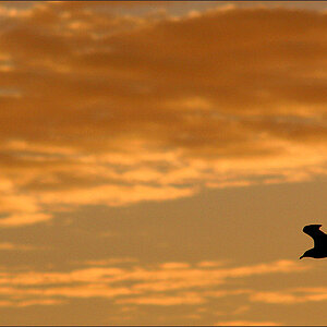
I like the tilt and the comp, but I think a better B&W processing could really make it shine. Perhaps a dash more contrast mixed with selective dodging and burning.
![[No title]](/data/xfmg/thumbnail/34/34078-48bd13f44e7bb42fdcc0154c5ee7c78e.jpg?1619736268)
![[No title]](/data/xfmg/thumbnail/32/32929-22e23acc63d6ecb25e5ee941be87121f.jpg?1619735758)
![[No title]](/data/xfmg/thumbnail/42/42327-560f11a37bb209e9091c0fc9e1028cdc.jpg?1619740128)


![[No title]](/data/xfmg/thumbnail/31/31751-fb2f68cca32f9eec468dbde7d649840f.jpg?1619734990)