What's new

7wk old baby girl

janineh

TPF Noob!
Joined
Jul 2, 2012
Messages
363
Reaction score
73
Location
Melbourne / AUS
C & C welcome!!!
 

Attachments

  • $image-2540848132.webp
    $image-2540848132.webp
    52 KB · Views: 101
  • $image-3040103656.webp
    $image-3040103656.webp
    59.3 KB · Views: 96
  • $image-3595850532.webp
    $image-3595850532.webp
    16 KB · Views: 91
C&C per req:

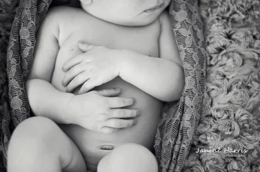
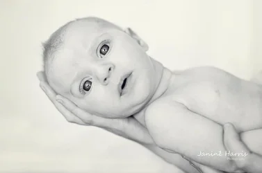
1. Not fond of the choice of wrap/resting blanket. It's just too close to the skin tone, and it's hard to tell where cloth ends and child begins. The eyes appear a bit over-processed, but that may be natural. Whe the close crop at the bottom?

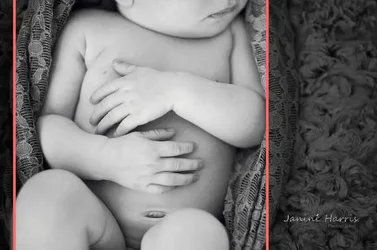
2. Ummm... Okay, a'splain me this one? Why a landscape orientation where you crop off most of the head and below the waist?

3. There's something a little uncomfortable about this; I think the way the head is 90 degrees to the torso and the wide-eyed expression gives her almost a doll-like appearance.

Just my $00.02 worth - your mileage may vary.

~John
 
I like these! Especially the second one, very unique crop and it works for me. 1 & 3 is not my favorite processing but but that's just personal choice.
 
Beautiful child, but how could you do her like that with the pics?

#1 evil alien eyes and skin

#2 top of head brutally sliced off

#3 totally what the $#$% is going on?

All of them the white balance appears both different and off.

I suspect the pics looked better before all the over-processing
 
yes wb is off. they are too cool. I noticed this in your other pics as well. I like #2, I love detail shots like this :). The focus is obviously the tiny newborn hands/belly and I think it is a great perspective. I think #1 could be improved by adding contrast and maybe some curves play. I don't really care for #3, baby has a strained expression.

 
I know you know these are not your best work.
These are way better.
 
paigew said:
yes wb is off. they are too cool. I noticed this in your other pics as well. I like #2, I love detail shots like this :). The focus is obviously the tiny newborn hands/belly and I think it is a great perspective. I think #1 could be improved by adding contrast and maybe some curves play. I don't really care for #3, baby has a strained expression.

Thanks for that. I might play around with the contrast a bit. I haven't done much processing to them at all as some think. I only done some skin smoothening and turned 2 of them in b&w...
 
tirediron said:
C&C per req:

1. Not fond of the choice of wrap/resting blanket. It's just too close to the skin tone, and it's hard to tell where cloth ends and child begins. The eyes appear a bit over-processed, but that may be natural. Whe the close crop at the bottom?.

~John

Funny, the use of a similar color impressed me! In my experience, fair skinned babies tend to reflect the colors around them. It can be cleaned up in post, but IMO, that's a bigger PITA than necessary.
 
I get #2. The chopped off head was intentional. It's not really a conventional baby portrait but I like it. It's just not generically commercial.
 
Who can't see that #2 is a picture of hands? They're right there in the middle of the frame! Baby's hands are the coolest things, and brutally hard to photograph in a way that shows the coolness and awesomeness of the tiny tiny little perfect chubby hand. #2 doesn't actually accomplish it, I am sad to say ;) The traditional approach is to include some object for scale. This was a bold attempt though, and you gotta respect that.
The other two are successful, albeit cliched. baby shots. That's what sells, so, for completely different reasons, I gotta respect THAT too.

I don't personally like any of these, but that's got nothing whatsoever to do with the case, and is irrelevant.
 
I think the issue is not the cutting off of the head but the fact that there is lots of space on either side. Instead of an impression of being close, the viewer first sees that the head and feet are cut off.
A square crop would emphasize the scrunched up position and the fact that the photographer is concentrating on the hands - and wouldn't leave all that space that does nothing.
 

Attachments

  • $image-3040103656lll.webp
    $image-3040103656lll.webp
    25.6 KB · Views: 85
i agree with traveler with the dead space. if you're going to have space it's odd to also have seemingly key portions of the baby cutoff. i'd also cut below the mouth. once you start seeing facial features it's a bad cut imo. i realize the intention is the hands, but my eyes immediately go to look for the face. there's just too much of it there for me to not look for it.
 

Create an account or login to comment

You must be a member in order to leave a comment

Create account

Create an account on our community. It's easy!

Log in

Already have an account? Log in here.

New Topics

Back
Top Bottom