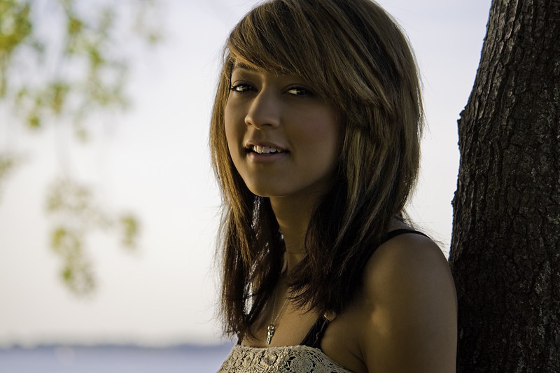
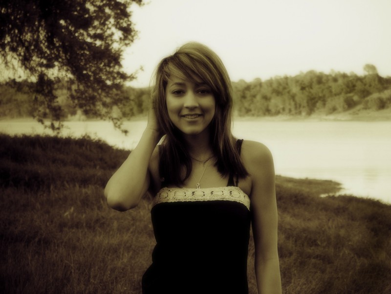
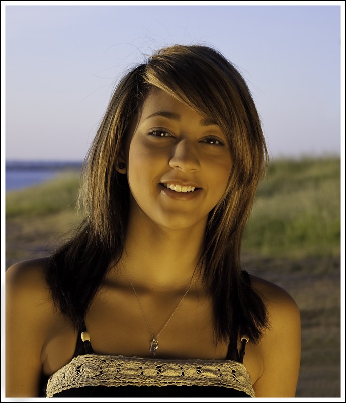
C. & C. as requested from a more experienced take. Number 2 is out of focus with a washed out sky. Number 1 would be better in a portrait format and with exposure for the model not the background. Fill flash or postprocessing is necessary to improve this one. The jewellry and top of the dress are visually distracting as well. In the nature of FYI, pros pick clothes carefully before any portrait shoot. Number 3 is the best in terms of having hair highlights, sharpness and the eyes better exposed, but it still has weaknesses. The lighting and shadows are not flattering and a problem around the eyes. The eyes should be where the visual focus is, but in Number 3 it is on the teeth which does not work for the image. The shoulder bones are emphasized by the low lighting and the jewellry and clothes distract from the eyes.
An interesting effort but portraits require a considerable amount of work and attention to the smallest detail. Keep at it.
skieur
")


![[No title]](/data/xfmg/thumbnail/30/30870-c7febc7c14dc6447653c2ae2355ffc61.jpg?1734158850)


![[No title]](/data/xfmg/thumbnail/34/34116-b81991a4a8a532509a981cadbacd573c.jpg?1734164576)
![[No title]](/data/xfmg/thumbnail/30/30871-c87f97bf2d9d493b4c08ba6482680038.jpg?1734158853)