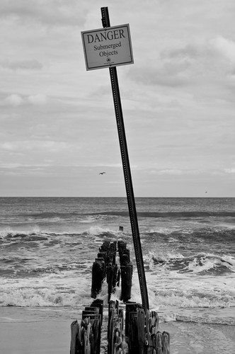
1- I really like the subject and REALLY like the black and white conversion. I'm just not liking the height of that post, it kind of throws the image off for me. Maybe getting up higher to shoot the same subject? You have a great eye in spotting those pieces of wood, and while I know it would be hard, getting those in the image without that tall post might help
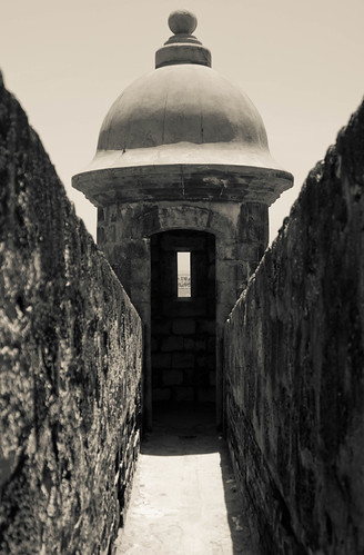
2- Really digging the lines in this image. I'm unsure about the colour conversion, but that's more an artistic choice. Fun subject, nice job.
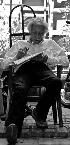
3- Yeah... uh... no. Well, not for me. The crop of the image is totally off, makes it feel like he is in a box. Way too much going on in the frame. He looks like he has a really interesting face, a landscape orientation and much closer on his face would be cool IMO, using his arm position to create some triangles, keeping the newspaper in the frame. But as it is here, I dunno, I dont like it.
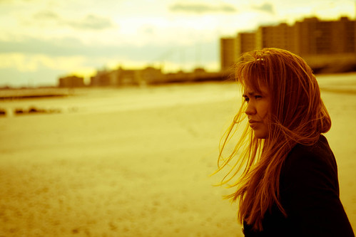
4- This one is very nice. Her gaze, the crop, her position in the frame, the lines of the buildings in the back. Very nice job. Did you try shooting her looking at you? Not sure if it would be better or not, but I'd like to see one with her eyes right at the lens, nice and sharp.