A few from the beach

travelerb

TPF Noob!
Joined
May 28, 2008
Messages
37
Reaction score
0
Location
Georgia
Can others edit my Photos
Photos OK to edit
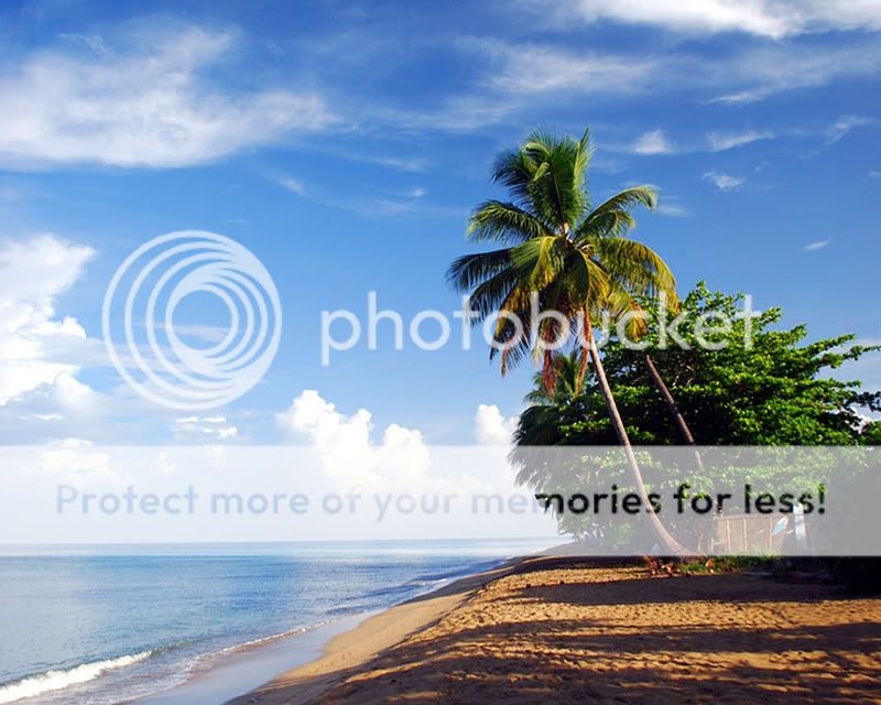
Still sorting through many shots from Puerto Rico, but was hoping for a little C&C on some from the beach.

I personally like the first one, it seems to be one of the better ones (and was coincidentally one of the first I took). Only a month with a camera now, and I can't get enough! I keep trying to think of places to go to take pictures on the weekends!

Anyway, I'm slowly getting more up on my Flickr page (in my sig, and each photo), and comments there are appreciated too.


I like the second one. I like the color of the water. If the bottom part of the picture have a little more exposure ... then it will be perfect.
 
I like number 1. I think you should crop out the building though
 
I like the second one. I like the color of the water. If the bottom part of the picture have a little more exposure ... then it will be perfect.

I think if the bottom had any more exposure you would loose all detail in the "splash". The contrasts are just too high.
 
good stuff!!
I really like number one, but with a tighter crop it would be better... lose some of the shadowed sand it kind of takes away from it.
and crop out the corner of the building on the far right and you'll have an awesome picture!!

I like the second one as well, it's a shame the sky wasn't blue, but you really have no control over that. :)
 
2616138400_740268957d_b.jpg


something like that :D
 
I hadn't even noticed the edge of that building in #1! I guess I was too worried about level horizons. Anyway, I just cropped a little off the side and bottom to take care of that, as shown below. I may do some more work to get rid of some of that sand at the bottom. I like maintaining "normal" aspect ratios in photos myself, no idea why though. I guess it makes it more challenging.

I'd agree with the foreground maybe needing a little brightening Dao, which is something I may try to see if I could edit. I took about 150 pictures out at that spot of the waves crashing against the rocks (some in the Flickr album). As Lynzi pointed out, and it isn't hard to tell, the light wasn't exactly optimal for freezing the wave action and getting a good exposure on the dead coral. The water was totally blown out whenever I got a good exposure of the coral, which generally didn't make for a good picture (one is not too bad though). Even in number two, you can see the blown out water, but it doesn't take away from the rest (IMO at least) given the outline of the splash. Plus, my eyes are drawn to the blue water, so I don't notice the white as much unless I'm looking for it.

Thanks for the feedback, and feel free to offer any critique or criticism (I can take it!). While I do like hearing positive things, I'm always looking to improve as well.

The sunset photo was one of the better ones as that subject went. Unfortunately, the sunsets weren't that great. And I like the composition in number 4, but I haven't got the coloring quite how I like it. The original was not too bad, and I think I just ran it through Auto-level in GIMP which didn't quite get it to what I wanted. I can't put my finger on it, maybe its just a little too red.

Anyway, here's the slight re-do of the first:

 
i love the depth of the colors. did you use a polarization filter?
 
Yes, all were taken with a polarizer.
 

Most reactions

Back
Top