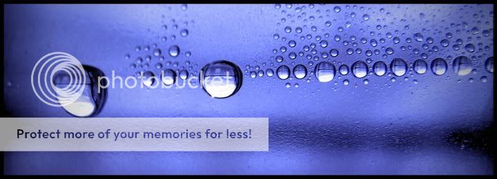
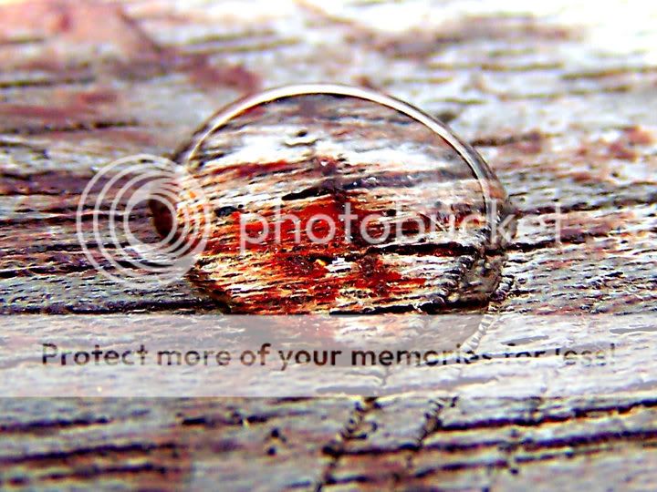
Not a fan of the composition of #2. I like the colors of #1, but the image as a whole is a bit boring. I do like the way the texture in #2 is magnified by the water drop.
There seem to be several horizontal (ish) lines running through #1 which I find interesting. The line of water droplets, that dark thing just below, and the little dark lines seen in the droplets themselves. Even some of the other light/dark transitions in the background run sort of horizontally.
#1 horz stretch framing was certainly the way to go but does lack balance vertically). The composition itself is somewhat monotonous with virtually nothing to contrast the circular patterns (even elongated shadows off the drops might help). The drops don't all seem to be in the same focal plane (or DOF wasn't enough) and I really think that for this kind of art image they have to all be in really good focus. Highlights of larger drops are begining to lose detail (and you really want detail there!).
#2 has technical issues that I can't quite identify. There is blowout at the top and along the upper outline of the drop (and, worse of all, within the drop) so lighting and exposure might have been an issue. But it has a weird overprocessed look as though it was made to look like it was taken with a really bad lens with chromatic alignment issues (that sort of thing). This doesn't add to the image and actually distracts or attenuates the magnifying effect of the drop. There is a lack of 3-d to the drop (maybe side lighting might have helped this).
Thankyou for the feedback guys its much appreciated and helpful, I've taken your advice on board and can see where ive gone wrong now, i`ll have another attempt soon


")
![[No title]](/data/xfmg/thumbnail/42/42270-4394b4f41a4b5d16152d8471f79ec2e4.jpg?1619740079)
![[No title]](/data/xfmg/thumbnail/31/31050-824a861ee359cd274a794fc7b9ff8f7b.jpg?1619734588)

![[No title]](/data/xfmg/thumbnail/34/34137-37e6e29a844c1214e5b14ce322c7b716.jpg?1619736309)
![[No title]](/data/xfmg/thumbnail/34/34590-9c0083ea54c78aad5db3d5884ae8b6c9.jpg?1619736564)
![[No title]](/data/xfmg/thumbnail/42/42269-bc38cb35884d46241dcf3623b338b43b.jpg?1619740078)