What's new

A few more for C & C.

Tight Knot

No longer a newbie, moving up!
Joined
Nov 30, 2010
Messages
1,398
Reaction score
159
Location
Boca Raton, FL
Can others edit my Photos
Photos OK to edit
Hi all,

Here are a few more photos.

Please let me know what you think.

1.Crab. taken at extreme end of 18-55m lens, +- 12" from the crab.

Crab.jpg


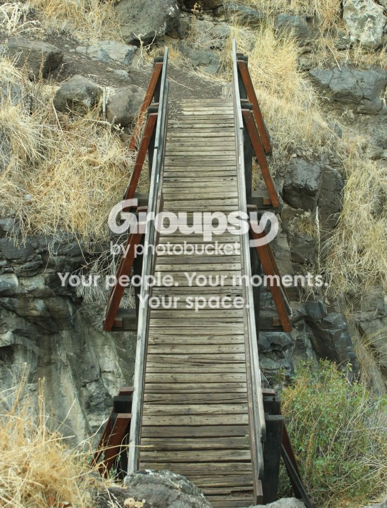
2.Bridge.
bridgeoverNahalHameshushim.jpg


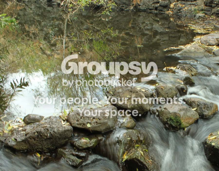
3.Reflection in the water
ReflectiononNahalHameshushim.jpg


4.Outdoor Portrait.
ChaimyPotrait.jpg


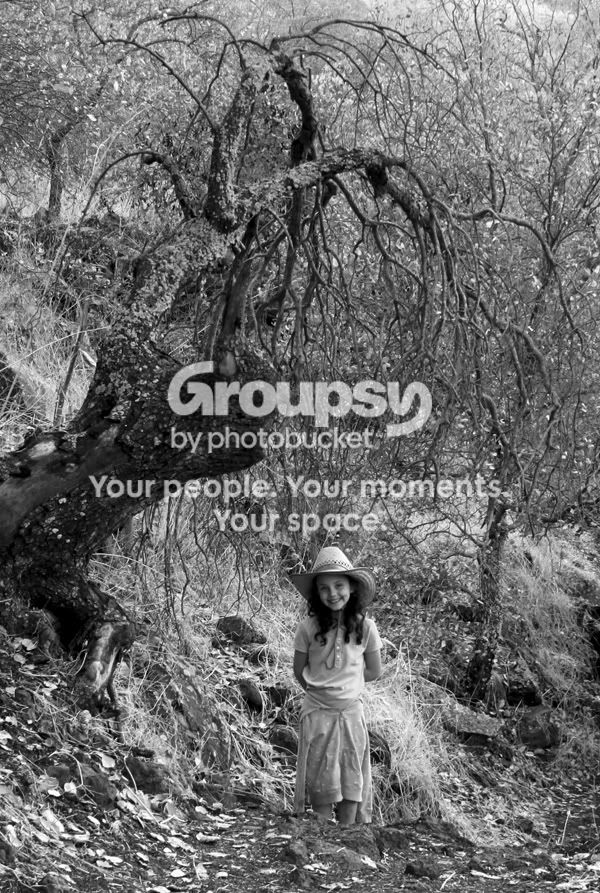
5.Girl under a tree B & W.
ChavionpathtoBreichatHameshushimBW.jpg


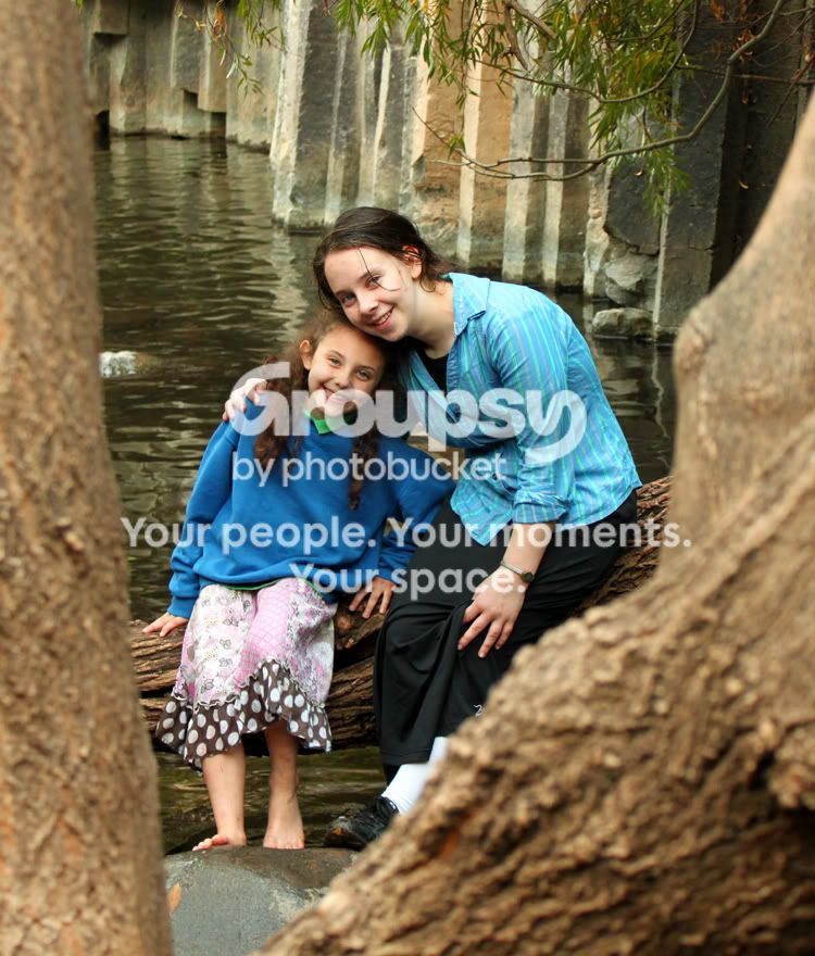
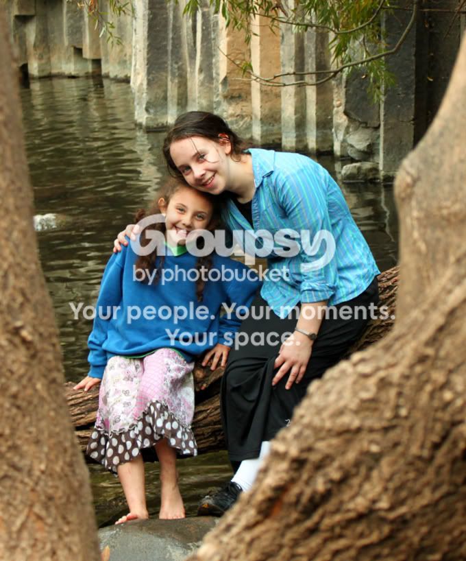
6. 2 girls framed by a tree.
ChomiandChaviframedbytree.jpg


7. Just an interesting one I saw of a rock that looks like a skull in the water.

Skullrockinwater.jpg


That's all for now folks.
Thanks again for all your help.
 
In #1 the crab looks foreign to the setting. Thus it don't work for me.
6. "2 girls framed by a tree." I find the non vertical lines in the background to be a distraction. I am very aware of verticals and horizontals that are off. It is just my training in photography. Others may not react negatively.
In 7. "Just an interesting one I saw of a rock that looks like a skull in the water." I would crop out the top right 2/3 and play around with lighting adjustments to bring out the skull thing to max potential. I'm sure it can be improved with adjustment.

Otherwise I like them all. I think you pretty much nailed 2."Bridge" right on. One more minor suggestion: 4."Outdoor Portrait" You could make the pupils perfectly horizontal. Use the top of the computer screen as the straight edge by scrolling them up to check. But it is fine as is.
 
Last edited:
Hi Sobolik, Thank you very much for your response.
A few questions, if I may.
1. Why do you feel that the crab is foreign to the setting?
I found and photographed the crab in the leaves without moving the crab. Those pincers just looked a tad too grabby for my liking.
2. I hear what you said about the "girls framed by a tree", what do you think of my correction?
ChomiandChaviframedbytreestraightened.jpg


3. I straightened the head in "Outdoor Portrait", but it means I had to crop quite a bit more. Which do you think is the better photo?
ChaimyPotrait-1.jpg


4. I cropped the "Skull in Water", but wasn't sure how to adjust it in any other way, what did you have in mind.
Skullrockinwatercropped.jpg


Thanks again for your input.
 
5.Girl under a tree B & W.
ChavionpathtoBreichatHameshushimBW.jpg

THIS!

I absolutely love it!
I love the feel of the big gnarly tree looming over the sweet little girl. I love the effect of the "bright" leaves in the tree, which is echoed in the leaves on the ground in the bottom left. The image feels busy, but in a subtle way if that makes sense, in a good way. This image has a storybook fantasy appeal, to me. The composition is nearly spot on. I just wish the girl was over to the right just a bit. :mrgreen:
 
5.Girl under a tree B & W.

THIS!

I absolutely love it!
I love the feel of the big gnarly tree looming over the sweet little girl. I love the effect of the "bright" leaves in the tree, which is echoed in the leaves on the ground in the bottom left. The image feels busy, but in a subtle way if that makes sense, in a good way. The composition is nearly spot on. I just wish the girl was over to the right just a bit. :mrgreen:

THANK YOU VERY MUCH Bitter Jeweler, criticism is great, but praise sure feels good too ;). My only question is what would have been different if she was over on the right a bit more? What would that have done for the composition?
 
Have to disagree about #5. It's not good in black & white -- way too busy. I like the idea of the 'creepy tree looming over the girl' thing, but you need to find someway to better isolate the two -- either shoot it better, or manipulate it in post.
 
Have to disagree about #5. It's not good in black & white -- way too busy. I like the idea of the 'creepy tree looming over the girl' thing, but you need to find someway to better isolate the two -- either shoot it better, or manipulate it in post.
What do you mean about finding someway better to isolate the 2? And can you give me an example of manipulating in post? Unfortunately, I cannot go back to reshoot.
 
Have to disabackground because it would really help make the tree stand out. gree about #5. It's not good in black & white -- way too busy. I like the idea of the 'creepy tree looming over the girl' thing, but you need to find someway to better isolate the two -- either shoot it better, or manipulate it in post.
What do you mean about finding someway better to isolate the 2? And can you give me an example of manipulating in post? Unfortunately, I cannot go back to reshoot.
Isolating the tree in the foreground from all the crap in the background. Bitter's edit is better than yours because the tree is darker / bg is lighter -- there is more separation. An ideal shot would have fog in the background because that would really help the tree stand out. But I realize that is not something you can count on.

Look, #5 may be the best it's ever going to be. Something to keep in mind for next time is less clutter = more effective b & w.
 
Thanks White,
I see what you're saying about the difference between my original and Bitter's edit. And I also hear what you are saying about Better B & W = Less Clutter = Better B & W (to paraphrase).
Now my only question is, how did Bitter do that?:confused:
 

Create an account or login to comment

You must be a member in order to leave a comment

Create account

Create an account on our community. It's easy!

Log in

Already have an account? Log in here.

Back
Top Bottom