What's new

A few new photos for C & C

At this point I'm interested in what YOU have to say about your own photos. You've given us zero information on them. If you C&C your own stuff, then we can fill in the blanks on what you missed and you will benefit more from it. And if you've never C&C'd before, doing it on your own work is the best place to start. :thumbup:
 
At this point I'm interested in what YOU have to say about your own photos. You've given us zero information on them. If you C&C your own stuff, then we can fill in the blanks on what you missed and you will benefit more from it. And if you've never C&C'd before, doing it on your own work is the best place to start. :thumbup:

OK, Ive never c & c before but Ill give it my best.

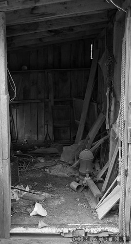
#1 is my favorite, I think I framed it well with the door frame. Exposure and composition seem good also.

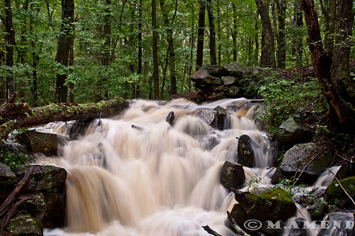
#2 I really like as well although it seems a bit underexposed.

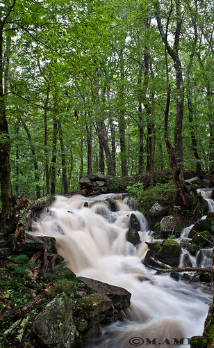
#3 I like, everything seems good about it to me.

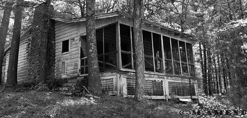
#4 I like the composition but something doesnt look right with it. Maybe it was the edit, im not sure. I mainly put this one up so someone could help me figure out what went wrong with it

#5 I like, I dont think its great but I dont think its bad.
 
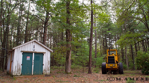
#1 - what are we supposed to be looking at? What is the center of interest? That crop draws attention to tall skinny but that isn't what the picture is about.

#4 - a little free association might help here. What is the impression you are trying to give ' old, ramshackle, lost in the woods' - it doesn't look lost, it looks big and dominating. Maybe more space around it to give the impression of isolation.

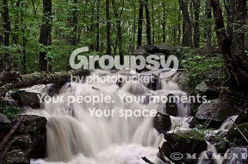
#2 #3 - tbh, if I never see another water fall with blurred water, I will be happy. It is a cliche and you'd have to do something really spectacular for it to have any interest.

#5 - house, bulldozer - what am I supposed to be seeing here, two potential objects but nothing to draw me to either.
 
C&C per req:

1. Interesting image. I think a little more light toward the back would have helped; perhaps just try brigthening it a little bit in post.

2. Not bad, but I think you could have gone with a slightly longer exposure. I would also try and "whiten" the water a bit.

3. I would crop a good bit off of the top of the trees, they're not adding anything, and maybe try leveling it.

4. Nice; I like this. If you wanted to really take this up a notch, you could try using a couple of speedlights on the porch to provide some illumination.

5. This one doesn't really do much for me. Is there a reason that you cropped the bottom so high up relative to the loader and building foundation?

Just my $00.02 worth - your mileage may vary.

~John
 
1. I agree with the other critiques in that there is nothing that is the focus of the image. I don't know what I'm supposed to be looking at. Part of the problem with that could be that it is so dark inside the building. I found myself looking towards the bottom of the frame at the stuff on the floor because that was all I could make out clearly.

2. I'm not completely sold on the composition. The trees at the top of the frame don't do anything for me, I would much rather see more of the water and where it goes.

3. I like how the creek is going diagonally across the frame at the bottom. I don't like the trees at the top, I don't think they add anything to the picture.

4. I think this is a pretty interesting photograph. I think color would work better as the green/brown of the trees would set the house apart from the forest it is set in.

5. The_Traveler pretty much covered what I thought about this shot.
 
C&C per req:

1. Interesting image. I think a little more light toward the back would have helped; perhaps just try brigthening it a little bit in post.

2. Not bad, but I think you could have gone with a slightly longer exposure. I would also try and "whiten" the water a bit.

3. I would crop a good bit off of the top of the trees, they're not adding anything, and maybe try leveling it.

4. Nice; I like this. If you wanted to really take this up a notch, you could try using a couple of speedlights on the porch to provide some illumination.

5. This one doesn't really do much for me. Is there a reason that you cropped the bottom so high up relative to the loader and building foundation?

Just my $00.02 worth - your mileage may vary.

~John

1. Ok, it was actually darker to begin with. I already lightened it some I was just afraid to go to far. I will try to brighten it up a bit more.

2. Ok, it was whiter to begin with, guess I went a little too far on the edit

3. Ok, will do

4. excuse my ignorance but could you explain what the speedlights are?

5. To be honest it really doesnt do much for me either, I like it a tad but thats it. I actually cropped the top and not the bottom.
 
Hello, I just thought id add... photo number 2 and 3, you can "whiten" the water a bit without changing anything else, I dont think it needed a longer exposure but that just my opinion. I tried this kind of shoot a while back and it was fun but I didnt like the brown colour of the water so I ended up changing most of the pictures to black and white, but you can just reduce the saturation of the orange colour slighty in lightroom, I hope you dont mind but I did a quick edit!

6128369899_3c3bb6be0a.jpg
 
I think my favourite one is the 3rd one...
 
Speedlight is a swappable term for a flash, usually off camera.

The images you provided I feel are tough to critique because they are technically good... exposure is good, focus is good, framing is technically good. It comes down to critiquing how you accomplished or failed to create or express a 'feeling', which in my very humble opinion is the purpose of art.

I can see the interest in #1, but like Traveler said, it's framed so there is a lot of empty at the top that doesn't seem to be serving much good. In addition, there is a really bright sliver in the middle of the darkness that is really distracting and draws the eye away. There does appear to be interesting things on the ground and the wooden walls themselves are a neat texture, but this area of interest takes up maybe only half the image, there's just not much detail there to hold my attention.

Brown waterfalls aren't attractive IMO. And there's nothing about these two waterfalls that is interesting. Waterfalls can't really stand alone to make a great image. You need something more I think.

#4, Good exposure, good framing, and I like the B&W conversion. The house is "falling backwards" a bit from perspective distortion, but not obnoxiously so. This can be fixed in photoshop, but it does create a tighter crop of the image and you don't have much to work with here... perhaps this is a crop of the original?

#5. I have no idea what you were going for here other than balancing an image with a shed and a frontloader. They seem to have no connection to each other. Perhaps you could go into detail about why this scene appealed to you and why you think it's a good shot.

Also see how much C&C you get when you a little effort into C&C'ing your own images first. I recommend working on your C&C though. I realize it's your first time, and that's fine, you have to start somewhere. But next time, provide details. "I like this shot" is a good beginning sentence to a paragraph or a conclusion, but you need to support that with specific reasons to answer the 'why I like this shot' or 'why this shot doesn't interest me' or 'why this shot isn't pleasing to look at'. Learn to do this to your own images and you're photography will begin to improve dramatically because you'll see things in the viewfinder that you can easily fix before you take the shot.

 
Speedlight is a swappable term for a flash, usually off camera.

The images you provided I feel are tough to critique because they are technically good... exposure is good, focus is good, framing is technically good. It comes down to critiquing how you accomplished or failed to create or express a 'feeling', which in my very humble opinion is the purpose of art.

I can see the interest in #1, but like Traveler said, it's framed so there is a lot of empty at the top that doesn't seem to be serving much good. In addition, there is a really bright sliver in the middle of the darkness that is really distracting and draws the eye away. There does appear to be interesting things on the ground and the wooden walls themselves are a neat texture, but this area of interest takes up maybe only half the image, there's just not much detail there to hold my attention.

Brown waterfalls aren't attractive IMO. And there's nothing about these two waterfalls that is interesting. Waterfalls can't really stand alone to make a great image. You need something more I think.

#4, Good exposure, good framing, and I like the B&W conversion. The house is "falling backwards" a bit from perspective distortion, but not obnoxiously so. This can be fixed in photoshop, but it does create a tighter crop of the image and you don't have much to work with here... perhaps this is a crop of the original?

#5. I have no idea what you were going for here other than balancing an image with a shed and a frontloader. They seem to have no connection to each other. Perhaps you could go into detail about why this scene appealed to you and why you think it's a good shot.

Also see how much C&C you get when you a little effort into C&C'ing your own images first. I recommend working on your C&C though. I realize it's your first time, and that's fine, you have to start somewhere. But next time, provide details. "I like this shot" is a good beginning sentence to a paragraph or a conclusion, but you need to support that with specific reasons to answer the 'why I like this shot' or 'why this shot doesn't interest me' or 'why this shot isn't pleasing to look at'. Learn to do this to your own images and you're photography will begin to improve dramatically because you'll see things in the viewfinder that you can easily fix before you take the shot.

Ok, the waterfalls where actually more white to begin with. I thought they were to "loud" so I tried to tone them down a bit.

#4 I took several different angles of this shot and yes this was a crop. I can post the different shots once I get home as I dont have access to them at work.

#5 I really dont know what I saw here Im not impressed with it either. It draws my attention all over the place.

Ok, I will start doing that and I see now how that will help me in the future. Thank you for taking the time to respond and explain things, I appreciate it.
 
Hello, I just thought id add... photo number 2 and 3, you can "whiten" the water a bit without changing anything else, I dont think it needed a longer exposure but that just my opinion. I tried this kind of shoot a while back and it was fun but I didnt like the brown colour of the water so I ended up changing most of the pictures to black and white, but you can just reduce the saturation of the orange colour slighty in lightroom, I hope you dont mind but I did a quick edit!

6128369899_3c3bb6be0a.jpg

At the moment I only own photoshop elements 9 which I use to do everything including edit my RAW files. Is lightroom a better program as far as editing RAW?
 
Just looking for some opinions and criticism, thanks!
#1

Welcome by markv20, on Flickr
I highly recommend posting photos 1 at a time if you want useful C&C.

Others have commented that the back wall is to dark. Some zoomed or snooted off camera flash (OCF) inside, but behind the wall on the left could have made for much more dramatic lighting.

6117641711_28e034b6aa.jpg
 
I think that #1 is a jumble and not recoverable without more space on the sides.
Just those little slivers of door frame make it look like a missed job of framing the picture - and the perspective distortion is also annoying.
Either be inside or out of the space.
 
Just looking for some opinions and criticism, thanks!
#1

Welcome by markv20, on Flickr
I highly recommend posting photos 1 at a time if you want useful C&C.

Others have commented that the back wall is to dark. Some zoomed or snooted off camera flash (OCF) inside, but behind the wall on the left could have made for much more dramatic lighting.

6117641711_28e034b6aa.jpg

Ok, I will do that from now on. I agree 5 is a bit much now that I think of it. Ah, that does look better.
 

Create an account or login to comment

You must be a member in order to leave a comment

Create account

Create an account on our community. It's easy!

Log in

Already have an account? Log in here.

Back
Top Bottom