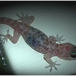
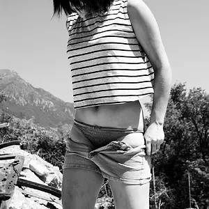
#4 reminds me of the intro to "The Office". The biggest thing that jumps out at me is the lack of contrast. Most of the blacks seem to look more gray than black atleast on my screen.
Your photos say they were alright to edit so I hope you don't mind. I was able to crop the finger out for the most part, still a little shadow there from it.
While I was doing that I converted the image to grayscale and use the Photoshop Elements 9 auto contrast to highlight the shadows. Hope you like.