Hey some very nice work there. C&C per req:
1. Nice image, and good expressions, however teh composition leaves a little to be desired. Ideally you want people walking into an image rather than out of; that is: You want more empty space in front of them then behind. Also try and to shoot at least a 3/4 profile rather than side on.
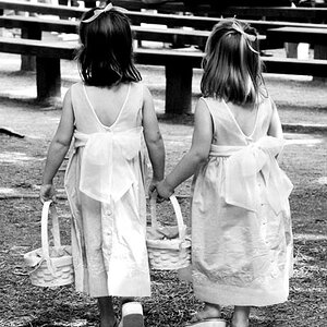
2. Nice, I like the informal look. Good work on the dress, but s shame that the second lady's head is cropped so low.
3. Very nice. You might consider this in a portrait (vertical) aspect vice landscape and crop more closely. This is a true wedding scene. Good exposure, but the colour in the boquet look a little overdone.
4. Nice, should be opened up a little wider.
5. A/A. Both of your conversions are nice, but a little mid-tone rich. I'm not sure that colour wouldn't be a better choice.
6. Not fond of the the composition of this; I'd prefer to see her whole face. Looking at what I can see, the highlights on her right cheek are rather strong. Be careful of window light - it can be your friend and your enemy.
7. Wow! I really like this one. Excellent idea and love the desaturated look. I think however this would have been a little better composed with the couple in the space between the two trees. It's always best to avoid having vertical elements (In this case the couple and the tree behind them) competeing with each other.
Just my $00.02 worth - your milage may vary.
~John



![[No title]](/data/xfmg/thumbnail/42/42493-2665d3a35f26795cc783aeb77329a032.jpg?1734177012)
![[No title]](/data/xfmg/thumbnail/41/41423-156eb6e5a056cd1cbcf60e12a03f9d56.jpg?1734175857)
![[No title]](/data/xfmg/thumbnail/38/38444-6063bb59cb410c520a1ccccbe58db9c7.jpg?1734172308)