What's new

a few recents for C&C

gardy

TPF Noob!
Joined
Sep 18, 2012
Messages
195
Reaction score
21
Location
Cheyenne Wy
Can others edit my Photos
Photos OK to edit
hello all,
i have a few here for y'all to take a look at and give me some feedback. just catching up on some editing the past few days.
let me know what yall think as far as the photo itself and anything i may have overlooked in post. i never ask for C&C on here but feel that it may be time to start using it as a valuable tool to improve. thanks
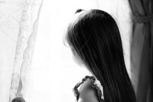

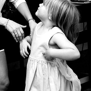
DSC_1841-Edit by gardy90, on Flickr
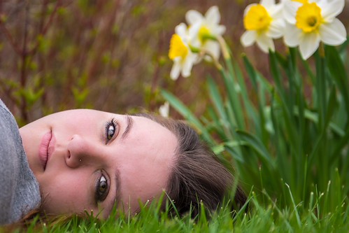

DSC_2935 by gardy90, on Flickr


DSC_2895-Edit by gardy90, on Flickr
 
#1 - 9
#2 - 2
#3 - 5

In #1, if only you had not gotten the dark curtain on the right, it would be a 10 for me.

#2 the model's face is partially obscured by her shirt, and the flowers compete for attention, and then there is the horizontal format of the model.

#3 Good pose, frame, light, and separation. Composition is rather static, and her outfit is nothing special.
 
#1 - 9
#2 - 2
#3 - 5

In #1, if only you had not gotten the dark curtain on the right, it would be a 10 for me.

#2 the model's face is partially obscured by her shirt, and the flowers compete for attention, and then there is the horizontal format of the model.

#3 Good pose, frame, light, and separation. Composition is rather static, and her outfit is nothing special.

thank you for the feedback, number 1 is my 5 year old girl. 2 and 3 are just from my wife and i out at the park for a relaxing afternoon, and i will admit that number 1 was more of a snapshot than anything, hence why i always keep the camera handy with the kids running around. i agree on number 2 with everything you said, she however loves it so i figured i would throw it in for the heck of it. on number 3 what do you mean by composition is static? as far as just a normal run of the mill pose?
 
#1 - I don't mind the dark curtain. I'm a little distracted by what looks like a finger near the bottom left. But I like this shot - very nice.
#2 - I like your wife's face and her eyes in this shot. I can see what you were going for but it just seems like her head is being squeezed out of the frame. Maybe try again a little wider and get her shoulders in the shot.
#3 - It's a good basic portrait. I don't see anything wrong with it - but then I'm not a pro.
 
I like #1 with the dark curtain, it adds balance. I'd probably clone out the finger, though.

#2 is a good idea. I think a slightly wider frame might have made it more successful? Not sure. It feels a little like a disembodied head, now. But mostly it's pretty good!

#3 is quite unflattering, although seems to be technically ok.
 
on number 3 what do you mean by composition is static? as far as just a normal run of the mill pose?

Yes. Model is centered, lacking a "communicative" expression, very even light, all add up to less than inspiring.
 
Ok, noted, thanks!
 
on number 2 she wanted just her head in it, i will say it was her idea. she didn't want it to show her "fat," do yall have any tips for flattering poses for larger, or not so skinny models i could try?
 
on number 2 she wanted just her head in it, i will say it was her idea. she didn't want it to show her "fat," do yall have any tips for flattering poses for larger, or not so skinny models i could try?

I'm new so I don't have a lot of tips. A couple of things: use a zoom lens and zoom in/scoot back as far as you can. The compression will slim her down. Also, be aware of how she is posed. Don't have her body facing the camera directly - have her turn to one side and try to have a little space between her torso and arms - if they are together it will make her body look that much bigger. There are a BUNCH of posing tutorials out there.
 
Love #1. These are the pictures that makes people stop and look. It tells a story. Good work.
 

Create an account or login to comment

You must be a member in order to leave a comment

Create account

Create an account on our community. It's easy!

Log in

Already have an account? Log in here.

Back
Top Bottom