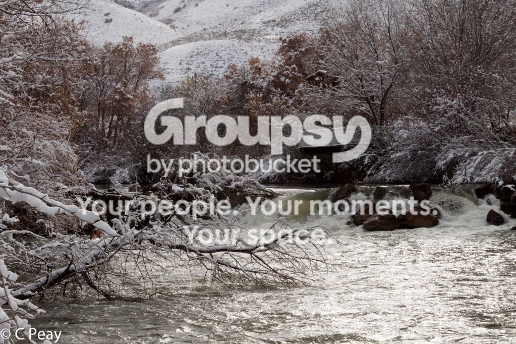
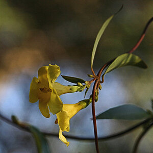
#1... Subject? Nothing catches the eye.
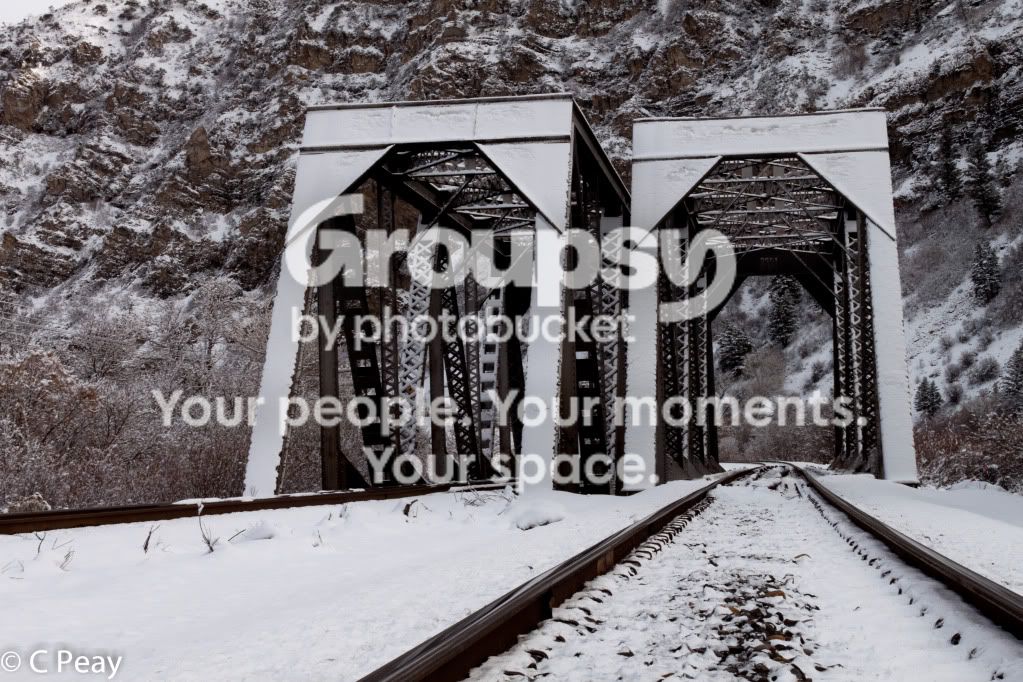
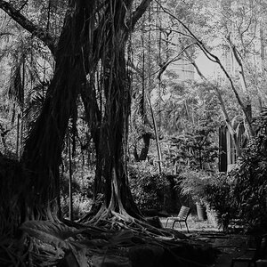
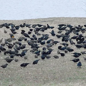
#2.. nice lines.. and constrasts. I would try it in B&W.. to monochromatic to be interesting as it. Make it contrasty....
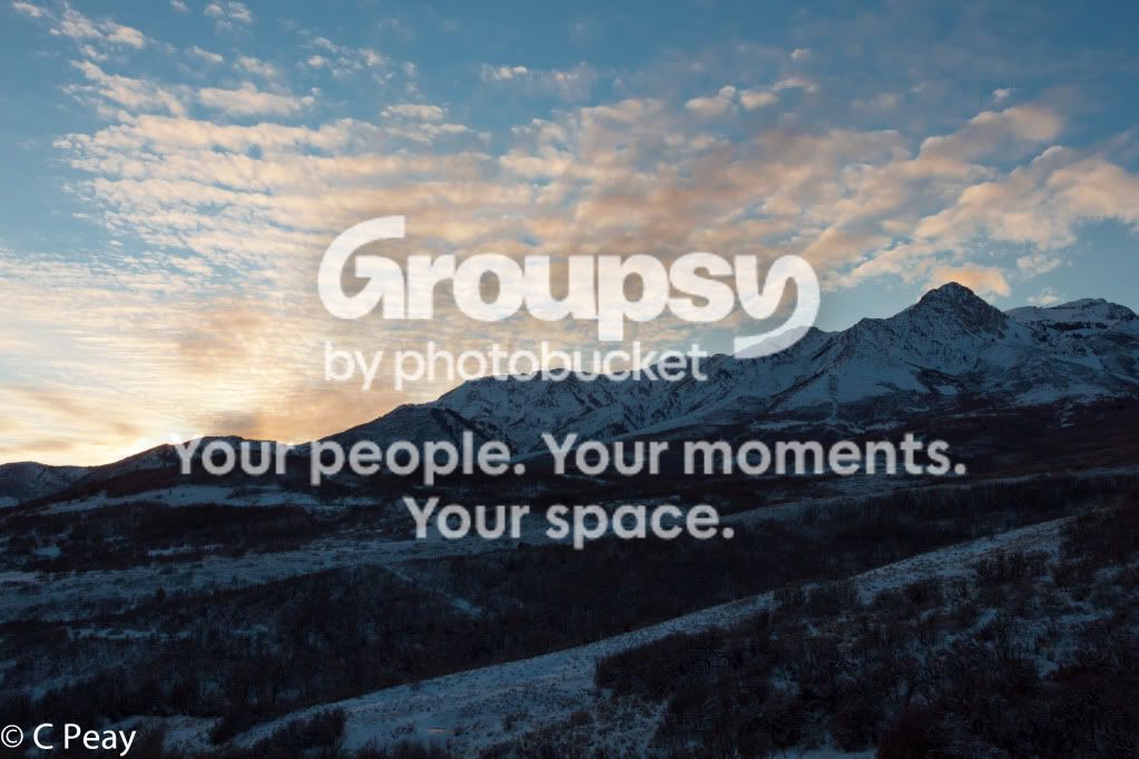
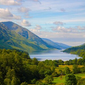
#3.. sky isn't bad.. could use a bit more contrast and color... foreground is too dark and way too blue. Would have been a good candidate for HDR..... try masking and bring up the brightness on the foreground, and color correct it.. blue snow isn't attractive.
#3 is missing most of the detail in the foreground... but I did what I could.... let me know what you think...