A Fountain By Six. (which one sucks the least?)

Which IMAGES do you like the most or that suck the least? (Check all that apply)

  • I like IMAGE 1

    Votes: 1 4.3%
  • I like IMAGE 2

    Votes: 2 8.7%
  • I like IMAGE 3

    Votes: 3 13.0%
  • I like IMAGE 4

    Votes: 7 30.4%
  • I like IMAGE 5

    Votes: 13 56.5%
  • I like IMAGE 6

    Votes: 3 13.0%
  • I like them all.

    Votes: 1 4.3%
  • I don't like any of them.

    Votes: 1 4.3%

  • Total voters
    23

Bifurcator

TPF Noob!
Joined
Jun 1, 2008
Messages
3,312
Reaction score
1
Location
Japan
Can others edit my Photos
Photos OK to edit

_______IMAGE 1_______
Fountain_000.jpg

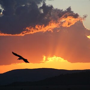
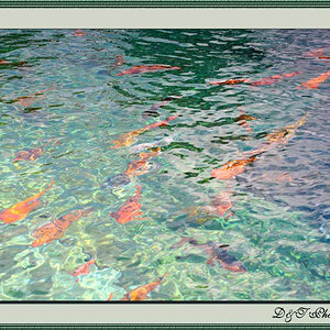
Exposure Set #1 - Exposure Blend (5 Exposures)


_______IMAGE 2_______
Fountain_001.jpg

Exposure Set #1 - High Dynamic Range Blend (5 Exposures)


_______IMAGE 3_______
Fountain_002.jpg

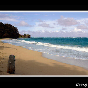
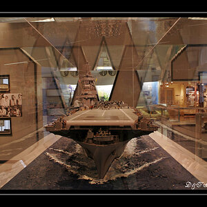
Exposure Set #2 - Exposure Blend (7 Exposures)


_______IMAGE 4_______
Fountain_003.jpg

Exposure Set #2 - High Dynamic Range Blend (7 Exposures)


_______IMAGE 5_______
Fountain_004.jpg

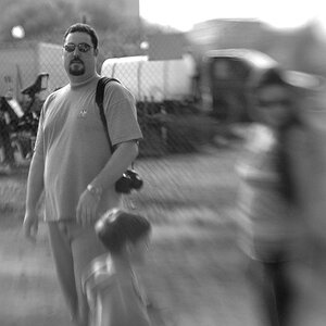
Exposure Set #3 - High Dynamic Range Blend (7 Exposures)


_______IMAGE 6_______
Fountain_005.jpg

Exposure Set #3 - Exposure Blend (7 Exposures)


Crits and comments always welcome!

- Enjoy!
 
Thanks! I favor the HDRIs too. They remind me of Kodachrome ASA 25 slide transparency film - which is what I shot mostly in my later film days.
 
Out of all of them, I would have to say that I find #4 the nicest. I also quite like the water cascading off the upper part of the structure in #5.

Unfortunately all of them seem to suffer some sort of perspective issue whereby the structure appears to lean to the right and back.

Great subject - I could see expending a lot of "film" there!
 
Number 4, but all of them need some straightening, distortion correction or selective postprocessing.

skieur
 
Yeah, what IS that anyway??? I was getting something like that in the bungalow shots too. I put guides on a few of these in PS and they check out. Man!, I just don't get it.:grumpy:

The camera was 22cm off the ground so I can understand why it's leaning back - but what optical illusion is at play here that makes them appear tilted? Gar...
 
Number 4, but all of them need some straightening, distortion correction or selective postprocessing.

skieur

Thanks. What kind of selective processing did you have in mind?
 
I voted #5 because I like the comp and colors the most in this one. I would watch out for the halos that you can get from the contrast of sky and dark trees that you have in that one. I enjoy the distortion of the shots personally. That's one of the reasons people get wide angle lens IMHO. Granted to get these same type of shots with a longer lens, you would have to back up quite a bit.
 
Out of all of them that suck, number 5 sucks the least. Jk by the way :mrgreen:, they are all great, but #5 is still my favorite. I think you did a great job with the HDR (from what I can tell), the colors are nice! Very strange how the structure leans slightly to the right as others have said, but the lamp posts are straight.
 
I voted #5 because I like the comp and colors the most in this one. I would watch out for the halos that you can get from the contrast of sky and dark trees that you have in that one. I enjoy the distortion of the shots personally. That's one of the reasons people get wide angle lens IMHO. Granted to get these same type of shots with a longer lens, you would have to back up quite a bit.
Good tips, thanks! Also good point on the distortion! I like the vertical splay distortion that makes them seem to lean back but the tilt is annoying when I notice it. Maybe it's some kind of gimbal affect where when the vertical ring's distortion is high the horizontal distortion becomes acutely sensitive. <shrug>


Out of all of them that suck, number 5 sucks the least.

Ah, finally an honest man!

Jk by the way :mrgreen:, they are all great,

oops... :blushing: (hehe, gotcha... :lmao:)

but #5 is still my favorite. I think you did a great job with the HDR (from what I can tell), the colors are nice! Very strange how the structure leans slightly to the right as others have said, but the lamp posts are straight.

Yup, still scratching my head. Oh, well I can just rotate my monitor a bit to the left till I figure it out.

--
Thanks all for the comments so far! Good stuff! Very appreciated! The vote only people too! :thumbup:
 
I think that somewhere in between the last two saturation wise would be good
 
That's a good idea!

You're more than welcome to give it a shot if you think it's worth your time. Thanks for the comment! Sincerely appreciated!
 
Thanks. What kind of selective processing did you have in mind?

Well in number 4 I would bring up the texture and detail in the rocks in the foreground as well as some of the darker areas at the base of the monuments.

skieur
 
Out of all of them that suck, number 5 sucks the least. Jk by the way :mrgreen:, they are all great, but #5 is still my favorite. I think you did a great job with the HDR (from what I can tell), the colors are nice! Very strange how the structure leans slightly to the right as others have said, but the lamp posts are straight.

Problem with 5 is that the stone fence merges with the monument which is the centre of interest. Composition wise that is considered a no, no.

skieur
 

Most reactions

New Topics

Back
Top