A kiss is just a kiss!

keith foster

TPF Noob!
Joined
Nov 16, 2009
Messages
506
Reaction score
10
Location
Missouri, USA
Website
www.keithdewey3.smugmug.com
Can others edit my Photos
Photos OK to edit
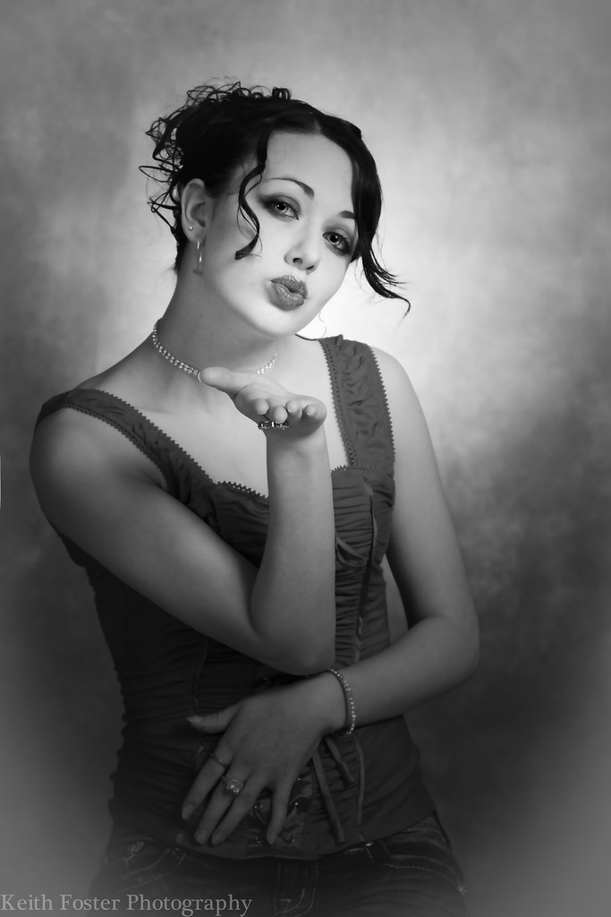
I have been working on a series of shots in which I have tried to get some of the looks from the old tv and print commercials back in the 60's and 70's. So I have been trying to get a modern look with a retro feel.
I have a couple shots I think finally got there and now that we seem to be clicking I think we will nail a few more.

Would like to hear your feedback, critique and criticisms. The shot is meant to be sexy without being sexual let me know if that worked.


4466112996_ab07bed1f0_b.jpg


I will post some of the others this week when I am happy with the pp.
 
I think it is sexy without being overly sexual. Attractive, fit-looking young model, check. Cute red vintage-style camisole type top, check. Pouty full lips, blowing the viewer a kiss, check. As far as the "no one hates this or likes this..." comment--somehow I had missed this post and it had slid to page two or something and here it is two days later, so as is common on TPF, the post kind of got lost...which as I said, happens all the time.

As far as making it better, the two background wrinkles are really distracting. I'm not a big fan of the somewhat dark looking lower part of the photo, but I think you have done a really good job of making light advance and dark recede. Whatever is lightest appears to visually advance,and the mask of her face and her chin line have a good main light placement; her neck drops into slight shadow,and her outstretched hand is like six-tenths of a stop darker than her face, and her nose,mouth,and chin are brighter than other parts of the face and torso, so the effect from the main light placement is almost perfect! The darker hand in front of the brighter chest area makes the subject appear to have real dimension. Overall, I think this is an excellent choice of the main light's position and height and aiming--really good on that.

I think if you cloned out the background wrinkles and darkened the background on the upper right hand side a bit, this shot would be even better. I'd like to see a bit more detail in her hair too. Overall thought, I think the lighting setup and the model's position are just super.
 
Thanks for that Derrel! Detailed and helpful as always.

I hadn't thought about how quickly a post can slide off the radar, especially since I posted it so late at night.
You would think I have been around long enough now to know how things work.
 
To really get the retro feel I would go with a different backdrop, maybe try and find a patterned retro wallpaper that would work. It doesn't go with the feel in my opinion.
 
I like it!

Very good suggestions too. Thank you.
 
Being an old fart, and loving the whole retro thing...
I agree about the backdrop, and maybe a little about the darkening around the perimeter.
The model is beautiful, she is almost there... Her hair does not speak retro to me.

Of course, my opinion is just that...

Nice shot though, beautifully done.
 
Thank you MDWine for looking.
I appreciate your opinion and input. I think you are right about her hair. This young ladies hair is very long(below her waist) and it was definitely a challenge to get it to a style that looked totally right.

I will be shooting some more of her next month. She is a lot of fun to work with.
 
total n00b here when it comes to photography but for some reason, the shadow under her chin and the position of her head seems distracting to me. idk why but it just makes her head look a lot deeper than it should.

this is by no means saying that it's not an excellent photo becuase it most certainly is... just my .02.
 
Thanks for taking a look. I appreciate the feedback.
Everyone's opinion is appreciated, that is how we grow. Even if I don't agree with you about something in a shot it still makes me take a look and rationalize to myself which way I think makes the better shot.
 

Most reactions

New Topics

Back
Top