aliyawar
No longer a newbie, moving up!
- Joined
- Nov 15, 2012
- Messages
- 349
- Reaction score
- 65
- Location
- India
- Can others edit my Photos
- Photos OK to edit
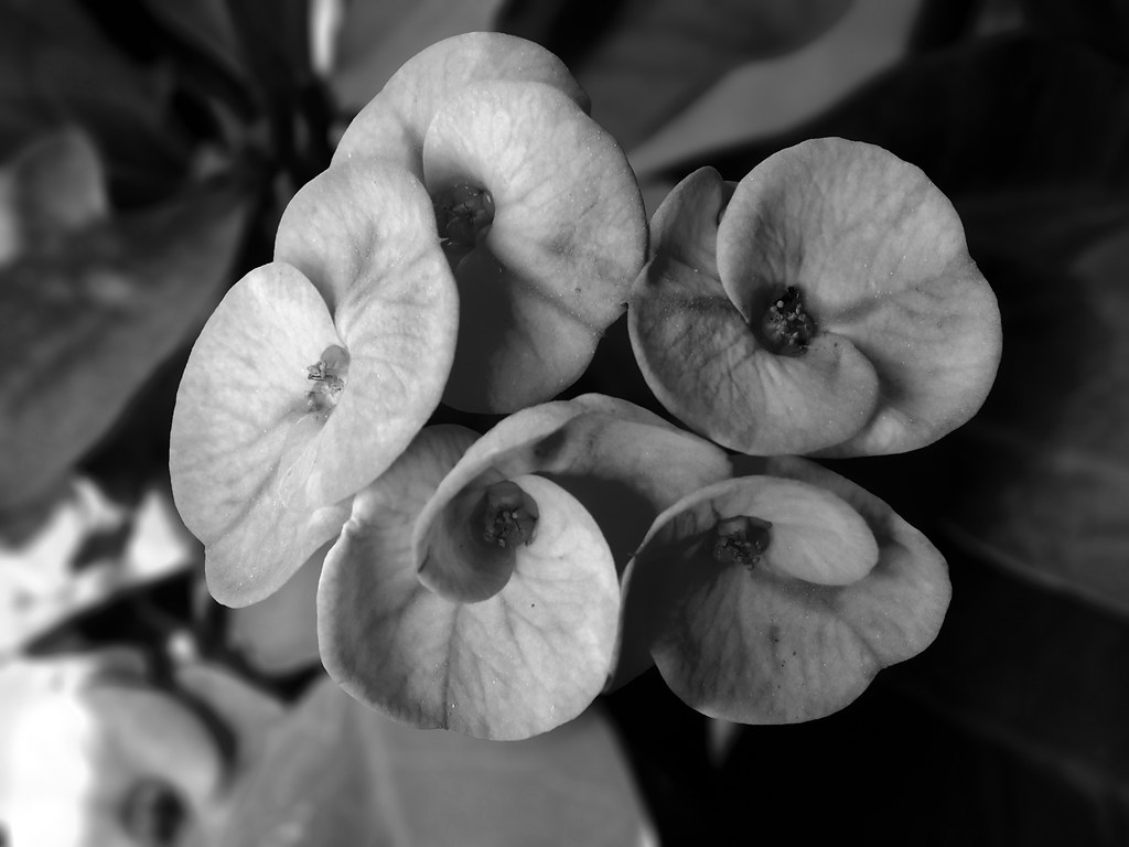
Some images i took in my garden in the morning time.. All B&W... C&C please.. ")

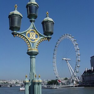
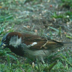
Garden morning-1 by AliYawar.M, on Flickr

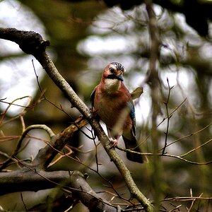
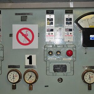
Garden morning-2 by AliYawar.M, on Flickr
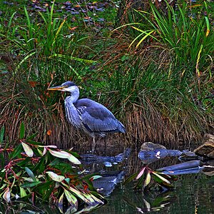
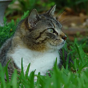
Garden morning-3 by AliYawar.M, on Flickr

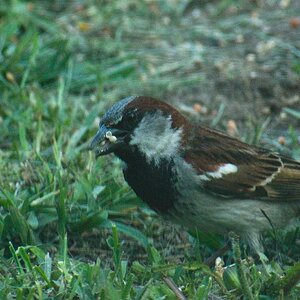
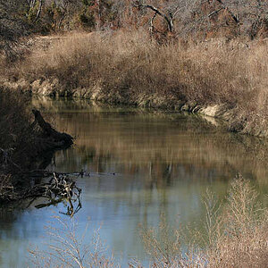
Garden morning-4 by AliYawar.M, on Flickr
Garden morning-1 by AliYawar.M, on Flickr
Garden morning-2 by AliYawar.M, on Flickr
Garden morning-3 by AliYawar.M, on Flickr
Garden morning-4 by AliYawar.M, on Flickr