Ok, I noticed you allowed editing of your images so I downloaded the picture and made notes of what was off. I hope you don't mind.
")
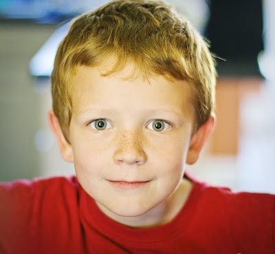
#1: The left side in the image has this grayscale tone to it. It's like the saturation was decreased to the point where color and grayscale share a common bounder. Not as good as a tint effect, but about there. Any idea what caused it?
#2: The top of your son's hair. If you had captured that much of his hair, why chop off the remaining in your crop? Personally I think the hair came out great and really shows the tones of his hair.
#3: The middle of the face is a bit overexposed. It washed out the details such as freckles, eyebrows, eye color, etc.
#4: The shirt's neck area. Left side is more focused than the right side. The camera had it focused there, why though? The main subject is your son's portrait, right?
#5: Right side of face isn't equally exposed and blurry. A perfect portrait in my opinion focuses on the entirety of the subject's head and not just their face.
#6: I just noticed the image has a dark vignette, was that intentional?
Do you use any editing programs such as Corel or Photoshop?
Overall this is a great picture, Jennifer. How old is he?
-Alex


![[No title]](/data/xfmg/thumbnail/37/37603-739c5d9b541a083a12f2f30e45ca2b7b.jpg?1734170731)


![[No title]](/data/xfmg/thumbnail/36/36299-468f060314a0ac2bf5e37da1c33149d2.jpg?1734168618)

