What's new

A Session in The Park

ColeGauthier

No longer a newbie, moving up!
Joined
Jan 29, 2012
Messages
284
Reaction score
56
Location
Timmins, Ontario, Canada
Can others edit my Photos
Photos OK to edit
Hi there guys, here is a recent outdoor shoot. C&C if you want! :) Sorry for the watermark, pulled from Facebook, once again.

EDIT: I've noticed my white balance is slightly off. I had a hard time with the light because the sky had a smokey overcast and the sun was a bright orange, was hard to judge over a small screen. Those damn forest fires are causing havoc.

#1
472158_309829345768760_212752952143067_645994_999294350_o.jpg


#2
456580_309834119101616_212752952143067_646007_525214921_o.jpg


#3
460342_310011832417178_212752952143067_646440_1375626709_o.jpg


#4
469605_309844589100569_212752952143067_646032_241078496_o.jpg


#5
460711_310018985749796_212752952143067_646447_1217757151_o.jpg
 
C&C per req:

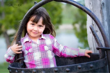
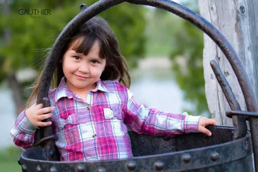
1. Cute! I like the pose here and the use of the kettle as a prop. The skin tones are good, but the white in her shirt are a bit hot. As well, I think a little bit of separation between her hair and the kettle's handle would have been good.

2. I'm NOT a fan of this type of pose; it really looks like he's trying to choke her. Instead, consider having his left arm on top of hers. Fill light was needed here.

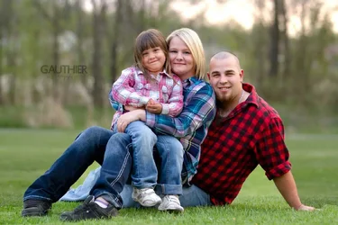
3. Nice family shot, good expressions, bad case of raccoon eyes.

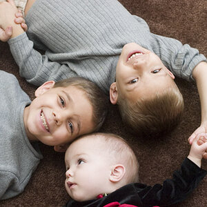
4. Selective colouring. 'nuf said.

5. I like the pose and expressions, but the background is just a little too busy for my taste. I would have looked for something with a few less lines in it.

Overall these are a nice set. You've done a good job of capturing their happiness, BUT it looks to me like you had them facing the sun. In almost all of them, they are squinting, and their eyes are rather racoon-like an lacking catchlights. Consider placing the subjects with their back to the sun and using at couple of speedlights to fill in and provide some life to their eyes.

Just my $00.02 worth - your mileage may vary.

~John
 
#1 So cute! Nice set overall.
 
#1 is My favorite of the bunch....

I tried to soften the brightness on the shirt to direct the eyes to her face. But I am on my iPad and am limited in what I can do. However you have a great shot that I am sure the family will enjoy very much. The second edit didn't come out as good as I would like. A little more blur than in the original. Your mileage will vary.

In #2 I don't care for the pose. His arm feels wrong in the picture but I am sure in life is is natural for him. Just the difference in the perspective of the camera.

I agree with the other comments on the other pictures.

Great work all and all..
 

Attachments

  • $image-236559556.webp
    $image-236559556.webp
    72.5 KB · Views: 138
  • $image-3530718047.webp
    $image-3530718047.webp
    51.4 KB · Views: 140
I think the light could be better managed in these.

In the first, the shirt is brighter than her face.

$fluorlll.webp
In the third the sky pulls my eye as do the shirts.

$thress.webp

Look at the pictures, figure out what is keeping your eye on the center of interest and remedy that.
 
#4- just why? Would they want a framed pic of him smoking? That one really turned me off on the whole set. I'm sorry, and the rest of them are good (I like #2- to me they have natural smiles and look comfortable), but that one I personally would have deleted. Did you crop the first one? I'd like to see it with moe of the handle or the top of the kettle (the rim).
 
Thanks for all the responses everybody

@semicolon: Thanks for the edits but I feel that the first one is way too hot and the second one has too much blur. Something in the middle? :)

@The_Traveler: Thanks a bunch! :) The more I practice, the more I know what to start to look for, these forums have really helped me with that, including you. Thanks

@mommy-medic: For #4, I wanted to try something different, for my purpose. They were family and I know exactly how they are, he did not have a problem with this. As for the kettle, this is the original edit with no crop. Thanks!
 
#4 is actually my favourite of the set... sometimes selective colour is annoying, but other times it works pretty good. I like it! :)
 
@LizardKing: I usually don't do selective coloring myself but this time it worked great! Thanks! :)
 

Create an account or login to comment

You must be a member in order to leave a comment

Create account

Create an account on our community. It's easy!

Log in

Already have an account? Log in here.

Back
Top Bottom