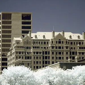
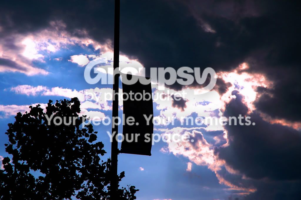
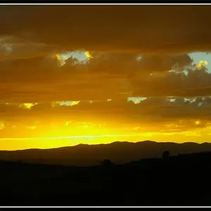
I'm probably going to be more harsh than your average photoforum user, but hopefully I can give constructive criticism. #1 the clouds and sky is really really nice. How did you maintain the detail in the clouds and tree? Were you using a filter? Spot metering? Post process? However, as nice as the sky is, both the sun and tree seem awkward. I probably would have tried an angle with either no tree, or find a way so that it balances in the picture. Its just kinda stuck into the middle of the frame, not doing anything of importance.
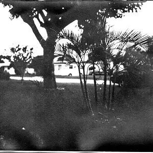
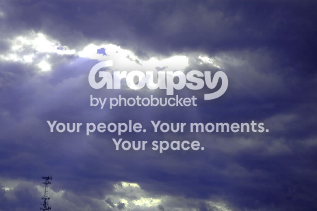
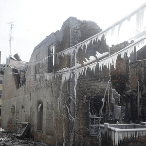
#2, I don't like it. I bet it looked really cool in reality, but I have no perspective. When taking it you should ask yourself WHY it looks cool. I bet that pocket of light had a really cool effect on the ground, so I probably would have chosen a wide angle lens or wide zoom and tried to get the sky and the ground and show the effect in all its glory. Anyways, that would just be my personal opinion, but it seems like you just saw it, thought it looked cool, and snapped a photo. Thats fine, but if you want really great photos you need to try and figure out why things look cool, and try and incorporate that into your frame.
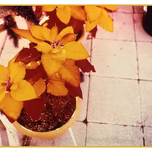
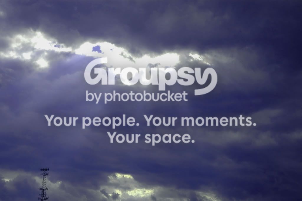
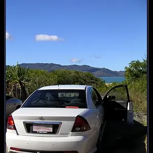
#3. I hate to be harsh but this one seems totally meaningless. It honestly looks like you just got the camera out and tested some closeups. The white on the left side is hugely distracting as well.
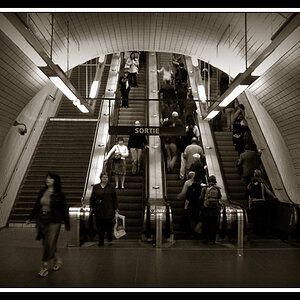
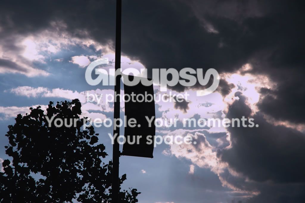
#4. This one is more interesting, but it feels like it is missing something... i don't know what, sorry











 )
)


![[No title]](/data/xfmg/thumbnail/30/30865-3dc03385b0036f80524b0636d0d56f07.jpg?1734158833)

![[No title]](/data/xfmg/thumbnail/30/30866-bdfc426e8ee7e6ad63f6d751c5f288f0.jpg?1734158835)