What's new

A Wedding I Did

buddah2099

TPF Noob!
Joined
May 19, 2010
Messages
17
Reaction score
0
Here are some pics that I did for a wedding. I would be interested in any thoughts that you might have.

DSC_0361.jpg


DSC_0051.jpg


DSC_0411.jpg


DSC_0244.jpg


DSC_0055.jpg
 
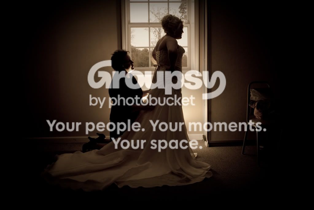
1 - is very dark and moody. On it's own, it could be taken as a photo narrative of a bride who has been stood up. She has her hands on her hips and the woman seems to be about to console her. Random, cropped chair.

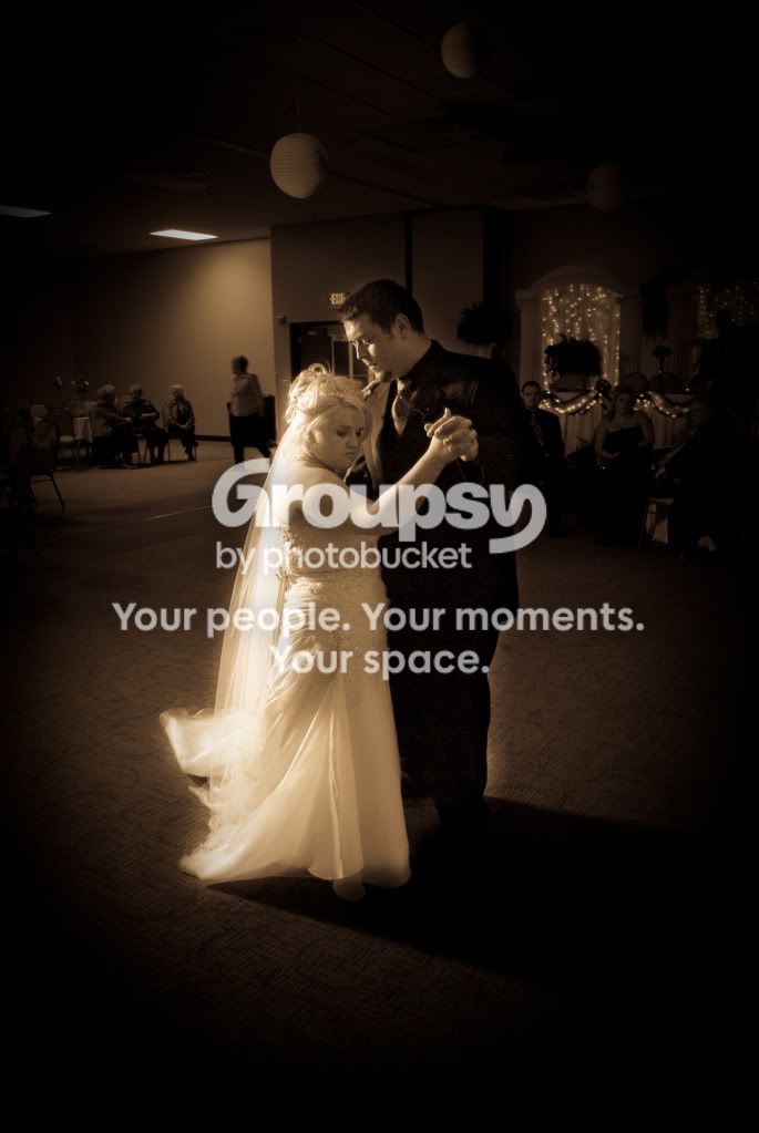
2 - You really need to get rid of the halo on the edge of the groom. Bride does not look happy in this shot.

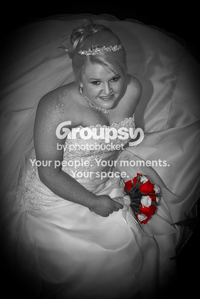
3 - nice detail in the bodice but her hair looks to be over smoothed. Are the flowers the most important thing in the pic? Selective colour can be very deceiving when not used correctly.

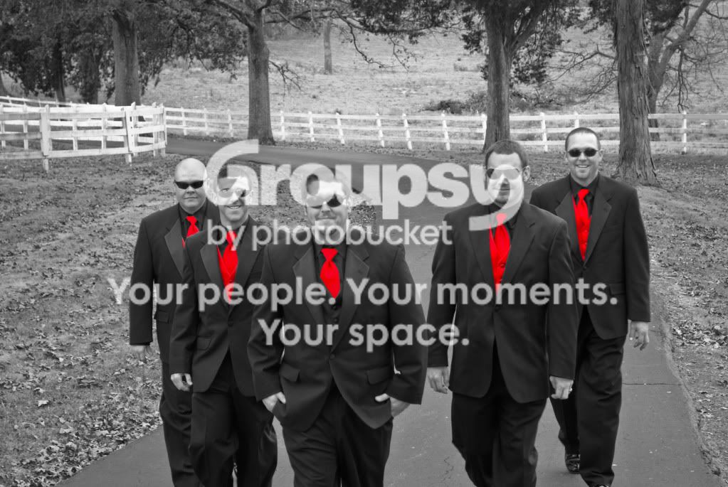
4 - Odd crop to show a lot of background and chop the right most usher. In this one the ties are really important?

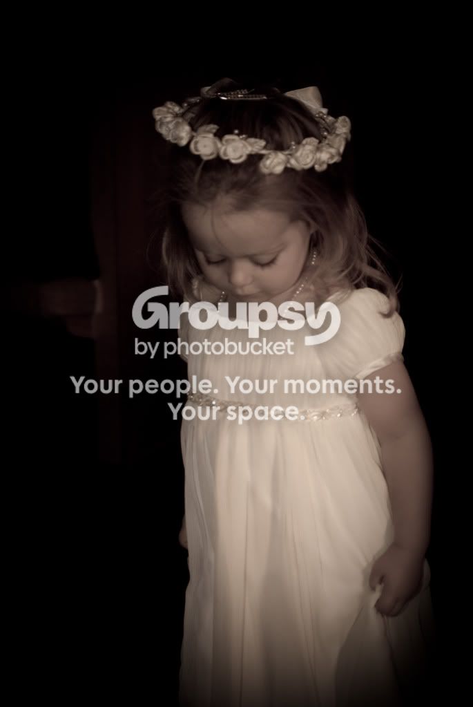
5 - cute girl. the head piece is really soft, which could be intentional, I guess.

Overall they seem dark and moody. Has the couple seen these yet?
 
I really enjoy the lighting in the first picture! However, I have to admit the picture of the groomsmen is borderline painful with the selective coloring. I don't mean to offend you at all--this is my personal opinion, and if you love it please don't take any consideration into what I have to say. It's just so bold that at first it looks almost like it could have been colored in MS Paint.
 
#1 Doesn't really do anything for me, very underexposed.

#2 Getting down lower might have masked her shortness. Again, not fond of how dark you made it, and you missed areas around them giving the halo effect.

#3 The focus is soft. The selective color works better here, but shooting down on the bride isn't flattering.

#4 I am not very fond of selective color in most cases. To me, it doesn't really work here because some of them have red shirts. Also, there is way too much room above their head and you cut the front guy straight through his knees. Never cut off a person at a joint.

#5 The focus is very soft, and again I am not sure why you made it so dark.

IMO weddings images should be brighter and more colorful. These are very bland, dark and depressing. B&W images have their places in weddings, but you have to know when to use it and not just throw it on any picture. Do you have any that aren't B&W with selective color or with the massive vignette and sepia color?

I am not trying to sound mean, so I hope you can take this as constructive criticism.
 
Yes they have and they really liked them.

1- I told her to let me know if there was anything specific that she wanted and she said that she wanted a silhoette of her and her mom getting the dress ready.

2 - She really liked it and suggested the glow.

3 - I took care of a pimple on her chin, I did nothing to her hair. And she suggested leaving the red in the black and whites.

4 - I had better cropped images but this is the one the bride liked best.

5 - The only photoshoping done was the color adjustment and vingette.
 
I am not a professional photographer (hobbyist) but I will give my 2 cents.
General Comments: I am not a fan of all the vignetting.

1. I dont like how the light is very bright on the kneeling woman's face but barely enough to get any detail out of the bride. It almost looks as if you were trying to get a silhouette by using a frontlight but it did not work out.

2. Again not a fan of the vignette. This image is very grainy and really was taken from an angle that is not very flattering for the bride. Possibly getting lower would have helped with the composition.

3. Same as my previous comments. Not a fan of selective coloring in this use as well. The hard shadow on her left shoulder and the shadow she is casting on the dress seem to outline her, perhaps some fill or a reflector would have helped.

4. Again not a fan of the selective coloring here and it is extremely over saturated.

5. Really the same general theme as above.
 
I'm going to be brutally honest here, because even if I were to mince words, the bottom line would still be the photos are not very good.
#1-exposed for the outside scene, which is sort of nice, but it could definitely use some more light on the bride. Also, the chair to the right is distracting.
#2-really bad lighting, distracting elements in the background, shooting from above makes the bride look even shorter.
#3-She looks really uncomfortable, like you needed to work on building some rapport. The exposure is okay, selective coloring is cheesy, and your camera seems to have focused on the flowers, not the bride's face
#4-pretty good shot, minus the bad selective coloring
#5-out of focus, motion blur, poor lighting, no interaction with the subject, really does nothing for me.

 
They are all very dark for wedding photos, like Josh220 said, wedding photos should be more upbeat and colorful, not dark and depressing. I too do not like the selective coloring on the groomsmen shot at all, I love playfulness of the shot, and just think it would be much better in color. As long as the couple loves them that is all that really matters, it was their day :)
 
2 - She really liked it and suggested the glow.

I think you misunderstood my point. It's not an intentional glow that adds to the image. It's a nonsymmetric glow caused by poor awareness of brush strokes in Photoshop. There's no way that was intentional.
 
Yes they have and they really liked them.

1- I told her to let me know if there was anything specific that she wanted and she said that she wanted a silhoette of her and her mom getting the dress ready.

2 - She really liked it and suggested the glow.

3 - I took care of a pimple on her chin, I did nothing to her hair. And she suggested leaving the red in the black and whites.

4 - I had better cropped images but this is the one the bride liked best.

5 - The only photoshoping done was the color adjustment and vingette.

This is going to sound harsh, but the comments are honestly intended to help. IMO, it is disingenuous to ask for thoughts and then defend poor work by blaming it on the bride's wishes.
A - Don't show the bride everything. Remember, this is your work that is going out there.
B - The couple is going to look at the images through a personal lens; this was their day. It's your job to show them the best of their day.

You have swapped out two of your previous images for different crops. Now instead of half a chair, you have the whole ugly chair with a tossed purse and bag on it. The new crop of the groomsmen has motion blur from the men walking. Was the other one sharper?

If you want the first image to read as a silhouette, get a greater range of tone with higher contrast. Pay attention to details like the chair, hole in the wall and bit of random hardware in the floor moulding. The hot spot under the mother's chin is really an area of unflattering high contrast and becomes a focal point. Consider the following edit:
3lpj8r
 
#4 is a good, well composed group shot but the selective colouring is perhaps the worst I have seen. Not only is it way over saturated but the red bleeds into the shirt on 4 of them.
 
My biggest issue with these pictures is that everything is dark and moody, like it's a funeral. Weddings are supposed to be happy occasions, but you've made the whole thing seem like everyone got dressed to say farwell to a loved one. It's kind of weird to see wedding pictures and get depressed.
 

Create an account or login to comment

You must be a member in order to leave a comment

Create account

Create an account on our community. It's easy!

Log in

Already have an account? Log in here.

Back
Top Bottom