What's new

Abandoned Insane Asylum

Hare0103

TPF Noob!
Joined
Mar 24, 2014
Messages
13
Reaction score
1
Can others edit my Photos
Photos OK to edit
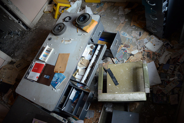
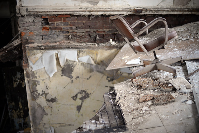
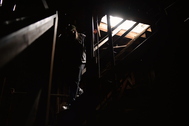
From the basement to the attic, nothing is left unexplored in this 178 acre building. Check out these photos and let me know what you think. What's your favorite? What do I need to work on? Tear these apart and let me know were I can improve.

Full set on Flickr here
One Flew Into the Cuckoo's Nest: Part 2 - a set on Flickr
 
Huh... I was expecting pictures of the TPF server farm!

Interesting set. I would love to be able to explore a facility like this.
 
Very few people are going to follow links as there is always the chance of a virus, not that you would start one, but links always have that possibility. You will get more response if you post 3 or 4 of your better shots and number them as this makes it easier for a reviewer to comment on specific images.

WesternGuy
 
This reminds me that we have one in our state. Spookier, especially in the dusk. Still being used though, so the casual visitor can't just go in.
 
Love these. Reminds me of when I went and took photos of Greystone Asylum in NJ. Nice work, mate.
 
Well there some here in CT that's are on list of some of the most alleged haunted insane asylums. Love to go in a few of them but don't want to be arrested doing so. The stories behind some of them are spine chilling and it really takes some brass to go inside of one. I am a skeptic on all this entity, ghost hooky pooky stuff but still gives me the spooks just thinking about it. Nice Shots.
 
Last edited:
This, and this location in particular, is almost becoming a cliche. While I am sure that something original can be done with it, I'm just not seeing it here - simply more well e()posed photos of pealing paint and spooky graffiti. When approaching something like this I think it's very important to look at it as anew.
 
This, and this location in particular, is almost becoming a cliche. While I am sure that something original can be done with it, I'm just not seeing it here - simply more well e()posed photos of pealing paint and spooky graffiti. When approaching something like this I think it's very important to look at it as anew.

I absolutely agree with you. However, I feel that "spooky" graffiti adds to the overall aesthetic of the building in modern times. With there being so much, with such vulgarities, I couldnt help but feel it indirectly added to the overall feel of the building, which was rundown and creepy. Am I primarily focused on documenting the graffiti? No. Although the building was very spooky in itself, with its natural aesthetic, it creeped me out more when i saw "welcome to hell" on a door attached to a dark room. Replicating how I felt while aimlessly frolicking amongst the building was something i wanted to exemplify in the images and the graffiti contributed to that.

The peeling paint, while cliche, is beautiful. It shows what time does to buildings and the more it peels, the more texture is involved. It's like tree rings, in a way. Observing the rings, you can make an assessment on how old the tree is. While less accurate, the degree of paint peeling acts in the same way, showing the age of the building.

Approaching this building, I was not taking any prior consideration as to how I was going to photograph it. I wasn't taking any other cliches into consideration nor have i even seen much similar photography (i also havent looked hard enough.) But I don't think abandoned insane asylums are cliche at all. Maybe a sunrise. But how many abandoned insane asylums do you come across?

But I like that you feel the way you do. Given the images I have provided, what would you have done differently, to avoid being cliche?

Thanks for responding!

 
Huh... I was expecting pictures of the TPF server farm!

Interesting set. I would love to be able to explore a facility like this.

From a photographic standpoint, how would you approach a place like this? How would you avoid capturing cliche images? What feel would you want your pictures to encompass? I was going for a creepy feel, which I suppose could be considered cliche, but that's how it really felt in there. Maybe "creepy" is a very general look to shoot for (no pun intended) and I would like to have a more specific message like "the mental institution was ineffective and inhumane" but this is just what I came out with.

Let me know how I could improve
 
There's a lot of great photos here...seriously good subject matter here. I'd suggest weeding out the "meh" photos and posting some of the best. You have a great sense of tone and composition. A few of these would be great in bw...I advice a slick contrasty conversion to bw and call in good. Nice work
 
There's a lot of great photos here...seriously good subject matter here. I'd suggest weeding out the "meh" photos and posting some of the best. You have a great sense of tone and composition. A few of these would be great in bw...I advice a slick contrasty conversion to bw and call in good. Nice work

Thanks! I started with the set at about 60 photos and have already weeded through the "mehs" to about 47 total. From your standpoint, which ones to you are "meh" and why? Tear these apart. I will return the favor.
 
Very few people are going to follow links as there is always the chance of a virus, not that you would start one, but links always have that possibility. You will get more response if you post 3 or 4 of your better shots and number them as this makes it easier for a reviewer to comment on specific images.

WesternGuy


Yeah you're right. Here's 4 shots I am on the fence with. I obviously like them but I know they could be better. Let me know what you like or would change. Thanks!

#1

13383626133_d0347fc09c_z.jpg


#2.

13384272894_68dbdebc8a_z.jpg


#3.


13384002025_37803df2be_z.jpg


#4

13383454244_f2b0d06165_z.jpg
 
Sure...Ok, so I'll try to address them specifically by description and "number"...even though they aren't numbered. And of course, this is just my opinion according to my specific style...but our "styles" seem to be pretty similar...

-The second..buildings only..there are some exposure issues that are pretty distracting on the RHS. But even with some adjustment, the subject matter doesn't seem to match the "interesting" factor of the others. But it is a good contributor of the set.

-"WARD 310"...sign only....is pretty meh in my opinion...compared to the others. It may work if the shot was straight on....and I'd bet you could get some good bw tones out of it. But the way it is shot...doesn't quite hold my interest like the others. I'd say hit it straight on....good detail...contrasty...get the good tones and texture in a black and white.

-"Let us know where you are" graffiti pic....doesn't do much for me. Not much to say about it. But I like it more than the next "They're here" shot. This one seems too deliberate. And the subject matter isn't quite there. The guy doesn't seem to have much to do with the text....in my opinion.

-the split-window shot with the brick building on the LHS....it is out of balance...and the perspective is slightly off. If it were straight...it would be great.

-wood benches with windows......doesn't do much for me. It's good, but compared to the others, doesn't keep up.


A bunch of these are completely off-the-hook shots. I'd be happy to elaborate on which, but I've already gave my 0.02. I definitely have my absolute favorites....and in general, I think you have a wicked awesome eye for composition, especially. Balance and an interesting subject matter, very well done.
 
I think I agree with unpopular here. Some of these are nice, but the set is rather mundane as a whole without a lot of effort put into creating something that stands out from all the other urban decay stuff.

I also agree with Charlie's comments and critique.
 
I think I agree with unpopular here. Some of these are nice, but the set is rather mundane as a whole without a lot of effort put into creating something that stands out from all the other urban decay stuff.

I also agree with Charlie's comments and critique.

I also agree with Charlie. Really see where he's coming from and appreciate the constructive criticism.

But to create something that stands out more than what I've provided, would you suggest better compositions? Or better subject matter? If you could analyze one of the shots I provided above and maybe give me an example of what you would do differently, that would be very much appreciated. Looking to learn as much as possible and still new with this camera. Thanks again!
 

Create an account or login to comment

You must be a member in order to leave a comment

Create account

Create an account on our community. It's easy!

Log in

Already have an account? Log in here.

Back
Top Bottom