Advice on getting this look

dcb83

TPF Noob!
Joined
Aug 5, 2010
Messages
15
Reaction score
0
Hi,
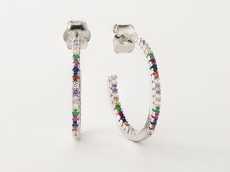
I really like the look of these jewelry shots. The colors and tones on the metal look natural and I really like the color of the background. I've analyzed the images and I'm pretty sure no cropping was done , there's one light source and minimal retouching was done as well. I may wrong. I've done my best to get similar results but nnnnnnot quite. I feel like my shots are a little dark and washed out. what do you guys think? Last three images are mine.

Please note that per TPF rules, you may not post images to which you do not hold rights - you may post links.
 
Last edited by a moderator:
Are you using a light tent?
 
No. I'm using one flash, some white foam core as reflectors and base where I place my items. And an opaque piece of plexi as diffuser.
 
Pretty close. I don't see how a photo could be dark and washed out at the same time. I think you have done a credible job. When I scroll through them all quickly none of them jumps out as being that radically different.
 
Might be the depth of field; doesn't look like all of both earrings is in focus (in both of the photos of earrings). Also the position of bracelet needed to be adjusted to make sure it was a more precise oval. (Look at the thumbnail, you can see it's a bit lopsided and needed to be smoothed out when you laid it down.)
 
They look to me like they're all in 3:4 format, which is not a native output from most cameras so you may want to re-visit the idea they've not been cropped.

I think your colours look decent and the lighting is pretty spot on so they are very close. Have you tried setting a white and black point in post? I think it may be enough to tip the balance as I think what you descripe as washed out may just be a lack of microcontrast.
 
They don’t look washed out but they do lack that pop that the others have. Also they appear a tiny bit darker. I agree with the poster above - a bit of post processing could fix it.
 
I agree. They're very similar. 5 days ago i was like, Yes.Nailed it.
Now I'm over thinking maybe. Never satisfied.
They look to me like they're all in 3:4 format, which is not a native output from most cameras so you may want to re-visit the idea they've not been cropped.

I think your colours look decent and the lighting is pretty spot on so they are very close. Have you tried setting a white and black point in post? I think it may be enough to tip the balance as I think what you descripe as washed out may just be a lack of microcontrast.

What I meant by cropped is I'm 99% sure their pieces weren't pathed out and edited while preserving the color of the background.
Yes colors seem fine but the images lack some pop. White and black point in levels in photoshop? Is there a way to do this without changing the background?
 
Please note that per TPF rules, you may not post images to which you do not hold rights - you may post links.

If moderators are going to do this, why not link the images themselves for the rest of us when removing it? This thread is absolutely pointless now...
 
Last edited:
These are my images...
Is there a way to have the items pop a little more without changing the background.
I have so many to shoot and really don't have time to path every piece. And I'd like the images to remain looking natural.
 

Attachments

  • IMG_7002.jpg
    IMG_7002.jpg
    234.4 KB · Views: 131
  • 1.jpg
    1.jpg
    558.1 KB · Views: 155
  • IMG_6972.jpg
    IMG_6972.jpg
    168.1 KB · Views: 168
I feel like my shots are a little dark and washed out.
Without seeing the example shot, I will have to guess at why you wrote what you did.

Your shots look evenly lighted, but maybe you should try getting some "sparkle" on your jewelry.

Also, your choice of background is not helping. Try black velvet next time. You wouldn't pose all metals on black velvet, but silver likes it.
 
Last edited:
I see a few issues you may want to address.
- Colour balance needs less red and bit of blue, your white is not white, a common issue with foam core especially if it is a bit old.
- You need a bit more contrast in you lighting, flat lighting loses the shape and pop in the gem stones and metals.
- Dodge and burn is where its at to give these some life. Blend If is your friend.
 

Most reactions

Back
Top